• Happy Earth Week! TBT is hosting a series of nature-based mini-events through April 28th. Breed flower hybrids by organizing your collectible lineup, enter our nature photography contest, purchase historically dated scenery collectibles, and earn bells around the site! Read more in the Earth Week and photography contest threads.

Does art style matter to you in video games?

Yes, art style matters a lot to me! More often than not I see the game as a whole, especially the gameplay, which become deciding factors for whether I'll play a game or not, but I will admit there are some games that I have turned down though mainly because of the art. I'll put my ramblings in spoilers just bc I'm afraid I'll strike a nerve with some people who like these games LOL

1700031853302.png

I've actually never seen the gameplay, but the cover art is just... a huge turnoff for me LOL. I love the background and the color scheme and the shadowing but man I'm just not a fan of the character design. It keeps getting recommended to me because I play SDV occasionally and I just do not like seeing this cover art I'm so sorry.

1700031990359.png

Looking at the character design rn I'm like... okay no I definitely do not like the style 😭

I'm gonna get tomatoes thrown at me I swear

When I got into the gacha rhythm game scene during the pandemic, I scouted different games in the genre to satisfy my gacha addiction. I was well into Bandori, a little of D4DJ, and soon after Project Sekai, but I just could not get into Love Live SIF, or at least its earlier groups 😭 Love Live's music SLAPS don't get me wrong, and I truly wanted to love the characters, but the art style just doesn't speak to me the same way Bandori or Project Sekai does. The cards sometimes feel dark, the hair shadowing feels flat, the eyes are too glittery 😭 I know I'm being so nitpicky and I really wanted to like SIF but I couldn't find it in me because of the art styles : (

For reference just wanna add some cards I really like from each game
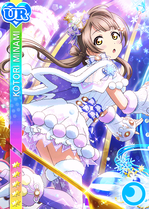
2261idolizedKotori.png

^ Love Live SIF

card_after_training.png

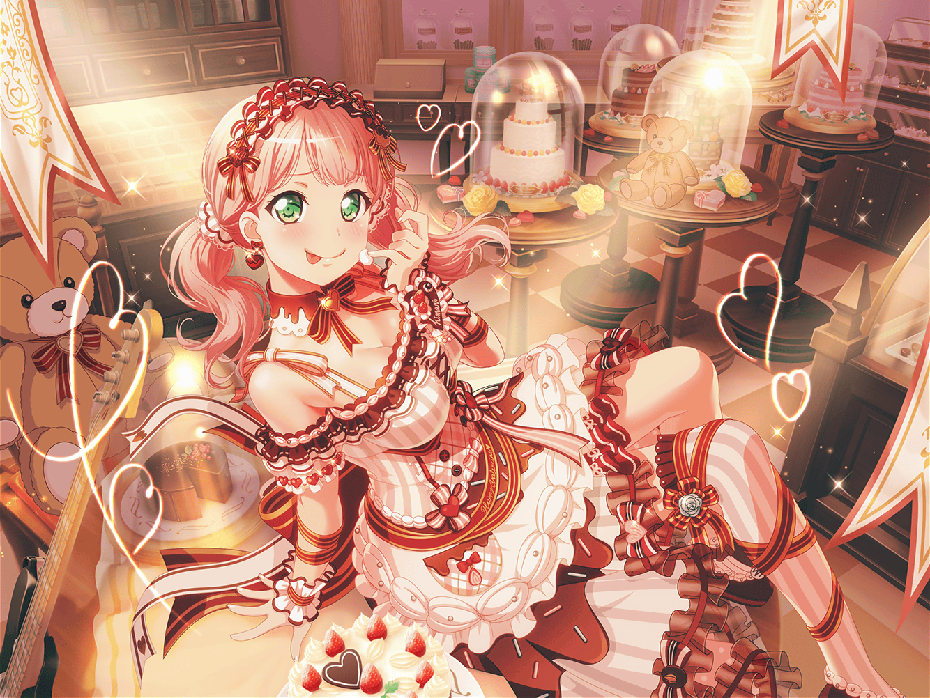
^ Bandori (Valentines Himari my beloved, also a pretty old card, also one of my first 4* cards)

Luka_4_trained_art.png

^ Project Sekai (literally one of the first 4* in-game)

Idk how cards work in Love Live SIF because I can see there are different art styles, but yeah LL cards just don't give me the same joy as Bandori or Project Sekai I fear :c also RIP LLSIF I never played you but I can tell you were loved by many
 
Yes. There are some art styles that I don’t like such as pixel. I’ve refused to play popular games like Stardew Valley and Undertale simply because of the art.
 
I'd say the art style matters somewhat to me, but I'm not super picky when it comes to art style. If it looked really bad to me though then it would probably impact my enjoyment of the game.
 
Yes, I think so. I actually really love the pixel style (opposite of @Bluelady haha), so I seek out those kinds of games. Not a huge fan of the realistic gritty artstyle in most AAA games, so I don't really play them much. Alongside pixel, I also love hand-drawn or illustrated looks.
 
I would say it does. I'm not super keen on 2D side-scrollers or pixel art games in general. Dunno why, I like pixel art and art from 2D games, but to actually play it is a different story, I guess.
 
i think art style definitely changes what games i pick up/am drawn too. but if i’m already playing a game and enjoying it the art style doesn’t matter to me at that point. like i still haven’t picked up scarlet violet because it’s so ugly imo, but even though the art is similar in arceus because i tried it first i really like it and it doesn’t bother me anymore.

i do like both pixel and rendered (?) models, beautiful pixel art or pretty colors and design factors a lot in if i choose to play a game. it’s the reason i picked up games like abzu, hi-fi rush, and the blazing blade.
 
Usually it's not too much of a deal breaker for me, unless I really don't like it. It definitely influences what I do want to play more than what I don't. Games with really appealing artstyles make me want to play them way more! One example is Star Ocean: The Second Story R. I loved the character art and played the demo, and now I'm intrigued to play the full game soon! My favourite game ever, Fire Emblem Echoes, has a gorgeous artstyle and character designs from one of my favourite artists, Hidari.

The only recent game that I can think of being offput by the artsyle of is Cattails: Wildwood Story. I like the character art for the cats, but the in-game models and pixel graphics just don't really work for me. I like other pixel art games like Stardew and Terraria, but this one doesn't appeal to me. Maybe I'll check it out some day regardless.

The only artstyle I'm really, really tired of is hyperrealism. It always ages poorly and can even feel uncanny at times. Stylized graphics always look so much better and usually age well.
 
I feel like videogames are mostly a visual medium, to me it's a very important part of the experience and it does affect my enjoyment of it.
However I mostly think that this comes to personal taste mostly, just like with art in general not everyone is going to like the same stuff, maybe someone is going to like a more abstract take instead of an overly polished and more "artistic" approach, even more simpler stuff like text adventures have a little something in the way they present themselves that I appreciate, and even stuff made by people who you can tell aren't very skilled artists can still come out good looking depending on the intention and heart they put on it, an example could be Space Funeral which looks consistently bad on purpose, or just games made by little kids but who put so much effort into it, it can resonate with you anyways I think.
The opposite is true, I don't like the artstyle of games like Genshin Impact even though they are super proffesional looking...
 
Graphics matter little but art direction is king. I can also second thinking that stylisation ages much better than realism. One of the reasons I dislike my most disliked game of all time is because of its cobbled-together art style that doesn’t retain the feel of the original.

And nooo, not Cattails! Haha I loved the first Cattails and I’m thrilled to play the second one soon.
 
I've played games with art styles or graphics that I didn't care for and still enjoyed them a lot. Good graphics and artstyle is a bonus, but game-play is top priority. I've played so many games that had great art or graphics and the experience was garbage because of horrible gameplay, a boring story ect.
 
Without a doubt. Art style is what gives games their aesthetics and, well, style. Splatoon looks the way it does because of the concept drawn to reflect the “fresh” vibe that it has. Donkey Kong’s redesign in Country solidified how the King of the Jungle will look for the next three decades (it’s hard to believe DKC will be 30 years old next year). And look at the Animal Crossing series: it went through various different systems and four generations of gaming, and it still retains its deformed, cutesy look, not because of the graphical changes in each game, but because its own art style has stayed relatively the same, with slight, but notable changes over time, which distinguish the games. To further make my case, let’s look at a non-Nintendo franchise… such as Halo.

The art of the Halo games has been a hotly-debated topic for a large bulk of the franchise's existence — since the better part of the New ‘10s, when Halo: Reach and Halo 4 drastically changed the way UNSC and Covenant armor, weaponry, and equipment was designed: the color palette being darker (moreso in Reach’s case), and Forerunner buildings and structures being pristine, clean, and shiny in 4 and 5, as opposed to in the Original Trilogy, in which they were faded, dusty buildings from an ancient civilization — which captured the backstory of who the Forerunners were. For more context into the earlier two examples:

UNSC


  • The UNSC took clear inspiration from the movie Aliens (‘86) in terms of design in the first game (much of Combat Evolved was inspired by said film). Halo 2 onwards made modifications to the Marines’ BDU, by giving them a pair of VZG7 armored boots greenish-gray camouflage fatigues (differing from the pure gray ones from CE; also sometimes given additional armor in the legs), with similarly-colored CH252 helmet (with a green tactical eyepiece) and armor. Halo 3 gave the design additional armor, and ODST, being a midquel released two years after, maintained this design. Reach as mentioned, earlier, fundamentally changed the way Marines looked. How so? Well, for starters, to match with the game’s more dire war-film tone, the fatigues were reverted back to grays of CE, albeit a bit more darker. This new uniform was accompanied with similarly-gray/brown armor worn in the knees, groin, chest, shoulders, and a CH252 helmet to cap it off. It’s one the few designs I think was improved upon the original trilogy, as I always thought the Marine designs from older games looked a bit dorky (albeit in a charming way), especially when put next to the unmistakably iconic MJOLNIR armor of Spartans. The post-Human-Covenant-War BDU armor, which Marines wear in Halos 4 and 5 was inspired by a design which was observed sometime in 2526. It comes with a pair pants with duo-color motif (green/red; white/red more Medics), a ballistic vest, and some revised pieces from previous BDUs, such as the CH252 helmet and VZG7 armored boots.
  • I mentioned Spartans earlier in the first bulletin, and Lord, is it a very complicated subject of this whole topic. Heck, it’s the go-to example of how much Halo’s art style has changed over the 22 years it has persisted. I’ll try to simplify this as best I can, but for a little context: Spartans are supersoldiers augmented to have strength, speed, reflexes, agility, and durability beyond that of a normal human being, and their armor is meant to both reflect, and further enhance their combat prowess. This MJOLNIR armor has gone through three separate generations, as well as three pre-production prototypes. The first generation, alone, has had four iterations going from Mark IV to Mark VII. These four revisions from the first three failed prototypes all followed the same template. They were green-cladded suits of armor worn over a black armored bodysuit. They also came equipped with a fusion pack to power the suits. The Gen 2 models were a vast departure from the Gen 1 sets, focusing on streamlining the exoskeletal framework, while also reducing the complex armor pieces. The template for this generation was diverting the armor’s key hardware into the armored bodysuit (techsuit) which would ease production and implementation of specialized components. Gen 3 offered the best of both worlds; it applied the techniques and advancements from the previous generation into the Gen 1 Mark VII model. To say that fans rejoiced when they saw the Master Chief — main protagonist in much of the franchise, donning a familiar suit he had worn in the second and third titles, would be largely understated. Halo: Infinite, despite the criticism it gets, is often lauded for returning the visual style to an older era of the series. Halo Wars 2 is also praised for this exact endeavor, though the reason for this shift back to old has a different justification.

Covenant


  • A religious collective of various alien species hellbent on the destruction of humanity for the sake of this prophesied “Great Journey”, all of these sects have also gone from gradual (sometimes sudden) changes in art design in each game. Grunts went from being “ugly cute” by fans in the first two games, to being “ugly” from 3 to Reach, to being HIDEOUS in 4 and onwards. Jackals came in two varieties in the first game, until they got a uniformed-look in the second onwards, up until, yet again, Halo 4 happened. Hunters had an exposed abdomen and green “eyes” on the side of their helmets in CE, though the blue armor was standard until Reach made it gray. Elites in Halo 2 kept the appearance similar to the first game, with higher-ranked Elites being granted different armor colorations, and even different helmets. For some odd reason, Elites were made bulkier in Halo 3, a change that still baffles me to this day. Reach… is an interesting case; Elites were made slimmer again, and their armor is easily the most diverse out of every other game, but I was always more drawn to the humble design of the first two games. Halo 4, still, takes a nose dive in quality when it comes to character design. Elites wear less armor and their skin is more exposed — to reflect that these Elites represent a splinter faction of the Covenant. Makes sense, but every single species in that game looks hideous.

A rather long-winded explanation of a point I’m trying to make, and I wish I could’ve written more about the designs of the Covenant. I also wanted to write about architecture, weaponry, and colors of both factions, but this post is already as long as it is. I felt this needed to be elaborated, because art style, like music, is what gives games their identity — how they stand from other games. It should NOT be overlooked.
 
Last edited:
It's need to be cohesive. Undertale and Baba Is You look wonderful. It's easy to mess up 3D art imo.

Since it was mentioned, Cattails is something that turned me off because of its art style.

Also Stardew Valley is like one of the prettiest games ever. Such an impressive work for one person.

It's not about the pixels, it's how you use them.
 
i like it when a game has a unique and pretty art style but i don't think it's necessary. fallout new vegas is one of my favorite games and every character in that game looks like a foot. also pee filter. but then i also adore games with bright colors or unique art styles, like thousand year door and disco elysium.

i will say, i'm not into modern pixel games.
 
it matters to an extent. i won’t play a game purely because i dont like the art style, but it can help in how much i like a game. i love breath of the wild as a game and the art style and direction is gorgeous, which makes me love it even more.

i will say i prefer pixel art more and more nowadays, when every game is getting so ambitious and the quality of the art is getting worse. i love the realism you can get now, but the coziness of pixel art really helps with the escapism factor for me.
 
I definitely care about art style, though I wouldn't say it's make-or-break for me. Gameplay is far more important. The only exception is that a lot of character designs in RPG and JRPG games put me off so strongly (with the flagrant sexism, racism, or even objectification of children) that I just can't stomach the game. (RIP Fire Emblem franchise, I wanted to love you so badly! </3 turn-based grid combat.)

I agree with other comments that I'm less of a fan of realism and more of a fan of creative, striking art that matches the subject material. Destiny 2 is really pretty with its fantastical elements that mostly aim for realism, Breath of the Wild has a more stylized look that still captures real-world beauty (kind of the way light, or water, or grass feel even if it's not photorealistic), and Paper Mario brings its own completely irreplaceable charm by looking to imitate things like stickers or origami. I think one reason Nintendo games often have longevity is because they tend to lean into stylized art direction instead of realism, and so the games don't look totally creepy ten years later.
Agreed. It's one of the reasons why Wind Waker is still one of my favorite from the Zelda series. That teaser trailer of Link fighting Ganondorf to showcase the GameCube's graphics really doesn't hold up as well as it did all those years ago. And when the art direction changed for WW from realistic to cel-shaded so many hated it. And now it's aged better than that trailer could've possibly ever hoped to.

Also agreed on FireEmblem. The ones for the gba and Ike's game are pretty good and don't have all those weird things like you mentioned. Awakening, Corrin's game, and forward had those weird relationship scenes where you could pet possible candidates for relationships. Or something like that? It was edited out of the overseas versions, but still just ick lol.
 
The art of the Halo games has been a hotly-debated topic for a large bulk of the franchise's existence — since the better part of the New ‘10s, when Halo: Reach and Halo 4 drastically changed the way UNSC and Covenant armor, weaponry, and equipment was designed: the color palette being darker (moreso in Reach’s case), and Forerunner buildings and structures being pristine, clean, and shiny in 4 and 5, as opposed to in the Original Trilogy, in which they were faded, dusty buildings from an ancient civilization — which captured the backstory of who the Forerunners were. For more context into the earlier two examples:

UNSC


  • The UNSC took clear inspiration from the movie Aliens (‘86) in terms of design in the first game (much of Combat Evolved was inspired by said film). Halo 2 onwards made modifications to the Marines’ BDU, by giving them a pair of VZG7 armored boots greenish-gray camouflage fatigues (differing from the pure gray ones from CE; also sometimes given additional armor in the legs), with similarly-colored CH252 helmet (with a green tactical eyepiece) and armor. Halo 3 gave the design additional armor, and ODST, being a midquel released two years after, maintained this design. Reach as mentioned, earlier, fundamentally changed the way Marines looked. How so? Well, for starters, to match with the game’s more dire war-film tone, the fatigues were reverted back to grays of CE, albeit a bit more darker. This new uniform was accompanied with similarly-gray/brown armor worn in the knees, groin, chest, shoulders, and a CH252 helmet to cap it off. It’s one the few designs I think was improved upon the original trilogy, as I always thought the Marine designs from older games looked a bit dorky (albeit in a charming way), especially when put next to the unmistakably iconic MJOLNIR armor of Spartans. The post-Human-Covenant-War BDU armor, which Marines wear in Halos 4 and 5 was inspired by a design which was observed sometime in 2526. It comes with a pair pants with duo-color motif (green/red; white/red more Medics), a ballistic vest, and some revised pieces from previous BDUs, such as the CH252 helmet and VZG7 armored boots.
  • I mentioned Spartans earlier in the first bulletin, and Lord, is it a very complicated subject of this whole topic. Heck, it’s the go-to example of how much Halo’s art style has changed over the 22 years it has persisted. I’ll try to simplify this as best I can, but for a little context: Spartans are supersoldiers augmented to have strength, speed, reflexes, agility, and durability beyond that of a normal human being, and their armor is meant to both reflect, and further enhance their combat prowess. This MJOLNIR armor has gone through three separate generations, as well as three pre-production prototypes. The first generation, alone, has had four iterations going from Mark IV to Mark VII. These four revisions from the first three failed prototypes all followed the same template. They were green-cladded suits of armor worn over a black armored bodysuit. They also came equipped with a fusion pack to power the suits. The Gen 2 models were a vast departure from the Gen 1 sets, focusing on streamlining the exoskeletal framework, while also reducing the complex armor pieces. The template for this generation was diverting the armor’s key hardware into the armored bodysuit (techsuit) which would ease production and implementation of specialized components. Gen 3 offered the best of both worlds; it applied the techniques and advancements from the previous generation into the Gen 1 Mark VII model. To say that fans rejoiced when they saw the Master Chief — main protagonist in much of the franchise, donning a familiar suit he had worn in the second and third titles, would be largely understated. Halo: Infinite, despite the criticism it gets, is often lauded for returning the visual style to an older era of the series. Halo Wars 2 is also praised for this exact endeavor, though the reason for this shift back to old has a different justification.
A month and a week, later, and still nothing to substantiate this gigantic wall of text no one cared about. I care though, and I've been thinking about giving this a go:


These are the Marines from the first Halo game. Anyone who's watched Aliens should immediately be familiar with this.
Halo 1 Marines


Here they appear in Halo 2 — quite different from what they were previously, with a green color palette that'd be synonymous with the UNSC, along with the armor-clad Spartans.
Halo 2 Marines


Moving on to the Marines in Halo 3...
H3 Marines in jungle near Voi


Reach is when the aesthetic shifted dramatically, yet it somewhat hearkens back to the grays I mentioned earlier and alluded to in CE.
Halo: Reach Marines


Halo 4 gives us yet another major design change with the Marines. Halo 5 pretty much does nothing else with this, other than recolor the armor in multiplayer and gives them additional chest armor.
H4 — Marines.png


Forgot to point this out, earlier, but Infinite continues the Classic Halo motif by giving the Marines the signature green color that embodies the UNSC. It just shows how dedicated it was to making Halo look like Halo, again, and not just another generic sci-fi alien franchise.
HINF_Marines_Render.png


I'd love to post some HW2 screenshots, because the game does this series justice aesthetically, as well, but I'm only doing the main games, at the moment.


Now for the augmented, super-human soldiers — the Spartans.

This is John-117, the primary protagonist and undeniably the most recognizable character in the series, clad in his Mark V MJOLNIR Armor in the first game.
Master Chief as he Appears in CE.png

Now on to the Mark VI. Again, keep in mind there are three generations of this hardware:
H2 and H2A MKVI.jpg


Then we have Halo 4/5's take on the armor:
Variants of MK VII Gen 2.jpg


And we've finally got Infinite, yet again, correcting this mistake.
HINF Spartans.png


For a bonus, here's some of Reach's Spartans. Game's lauded for having the most customization in the series, and held that title firmly for a long time. It might still be the best the series ever had in this regard. This is known as the MJOLNIR (B) Variant, worn by NOBLE Team.
Nobles One-Five.jpg


Noble Six Leading the Charge.jpg


That... was a lot. Covenant will come later.
 
Last edited:
Back
Top