Terrible. My island entrance looks terrible. I've had it a bunch if different ways, but somehow I never get it right. My resident services is somewhat close to the airport, and a space to the right. It's off kilter, and I've never found a way to make it look right.
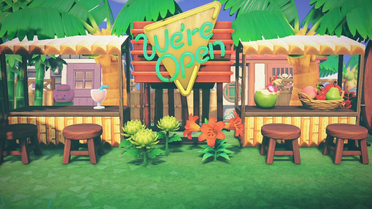
I had a sort of open square market type area, which just seemed, off. I once put nooks to the left of resident services to try to balance it. I've tried just putting all of the shops there. I've tried no shops. Whatever I put, it always looks a little bit off.
Then i tried sidewalks, with some pink flowers, very simple. I had the sidewalk go around in a square instead of straight up to resident services, because it just feels really weird to go in a straight line from the airport to rs and suddenly realize they don't match. This pic is just to the right of the airport.
View attachment 536771
But still, it wasn't right. I tried a curved path from the airport. I tried hiding it with cliffs. It just never seems right.
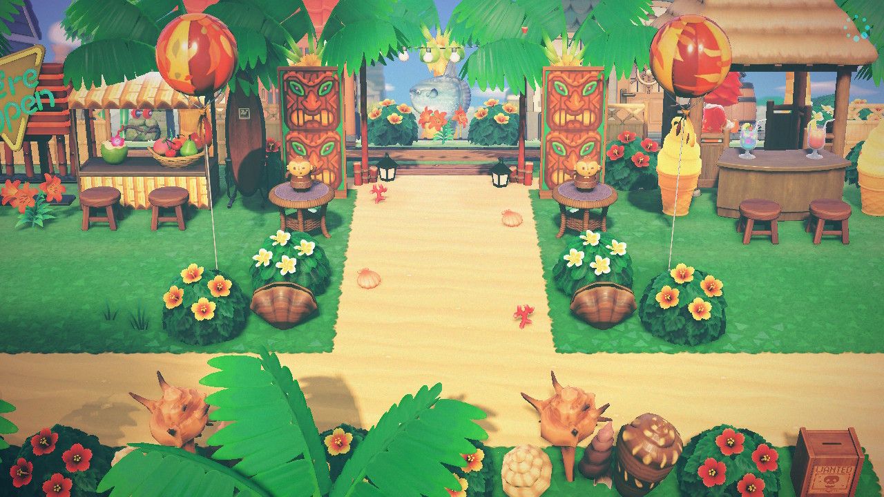
I think if rs were farther to the right, it could be disconnected from the entrance. But it's close, and just ever so slightly off kilter. This is what it is now.
View attachment 536773
You can see where rs is (can see the top of it), just to the right of the airport exit. I don't know why it bugs me. I'm heading into another island redesign phase, and will be experimenting more with it. Maybe I'll finally find some way to balance it out!


")


