Backdrop Variations for Celebrating Diversity 🏳‍🌈

Mistreil

🎈
Staff
Project Staff
Artist
Joined
Jul 11, 2013
Posts
3,089
Bells
388
Kiki Easter Egg
Fishbowl Easter Egg
Town Tune Easter Egg
Fishbowl Easter Egg
Lala Easter Egg
Blue Sakura
Blue Sakura
Blue Sakura
Blue Sakura
Blue Sakura
Hi everyone! As was seen and mentioned during Valentine's Week, I've been planning on making additional variations for the Amorous Auras backdrop. During the Valentine's event, the backdrops were more focused on romantic orientation due to the nature of the event, but the hope has always been to add more for Celebrating Diversity.

We'd like to seek your preferences for variations that you'd like to see added! Please use this thread as a place to make suggestions or to give feedback!

✅ Planned Variations
Below are a list of variations that I'm already planning to add to the list:
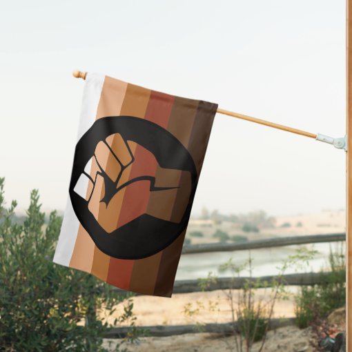
  • Agender
  • Genderfluid
  • Genderqueer
  • Non-binary
  • Two-spirit
And a few others that I'm planning on, but which I need more feedback. For these, we need to settle on a single option:
  • Aro/ace: There's 2 main versions of this that I've seen: the sunset one and the combined aromantic + asexual one. I lean towards using the sunset one, but I have no strong preference. So please do share if you feel strongly one way or another.
    Note: Yes, I know this means there will be aro, ace, and aroace variations. I fully acknowledge that I'm biased because I am also aro/ace.
  • Neurodiversity: The rainbow infinity! My main problem is that I don't actually know how to design this one. Rainbow infinity against a white background? White infinity against rainbow background? Rainbow infinity against a rainbow background but with an outline?
I'll be updating the above lists as more suggestions and feedback are given.

📝 Additional Notes
  • The lists I've started with are not meant to be exhaustive nor exclusionary: they're simply just the ones I am most familiar with and/or largely umbrellas. I am happy to add more specific identities to the list as they're suggested, even if they fall within an umbrella!
  • Suggestions do not have to be limited to romantic orientation or gender identity (as you may have noticed by neurodiversity being included)! Diversity encompasses many different aspects.
  • The deadline for suggestions will be May 17th: this will give me time to make the backdrops prior to June!
    (I won't have access to my computer after May 20th until mid-June, so these need to be created by then!)
  • While I will try to include as many variations as possible, I may have to put limits at some point as I'm a single person with very limited time. If there do end up being too many for me to create, I would like to ask for your understanding in that case!
    (I will try very hard to include as many as I can, though! I'm committed to this.)
 
Neurodiversity: The rainbow infinity! My main problem is that I don't actually know how to design this one. Rainbow infinity against a white background? White infinity against rainbow background? Rainbow infinity against a rainbow background but with an outline?

Personally, I like the third option the most out of these. And I guess my second favorite option would be the second option... Even though I would prefer a rainbow infinity symbol, a white background seems less appealing to me
 
I’m looking forward to seeing the finished product, especially the non-binary backdrop. I don’t quite feel I fall under the category of transgender since I’m AFAB and content with she/they pronouns despite presenting more masculine, at least in the eyes of others. I just go by a more gender-neutral name as opposed to my deadname.

In a perfect world, I’d go by Kaden with she/they pronouns, but it feels like it’s not going to happen as long as I’m surrounded by my family.

I resonate very much with the non-binary term and look forward to having that representation with the Celebrating Diversity event coming up. This is one of the events I look forward to each year because it lets me express myself in ways I wouldn’t feel comfortable doing otherwise.

I mean that it would be weird if I popped into an unrelated thread and talked about my identity. This is an event where everyone is recognized for their individuality and I like that.
 
Last edited:
Personally, I like the third option the most out of these. And I guess my second favorite option would be the second option... Even though I would prefer a rainbow infinity symbol, a white background seems less appealing to me
I also like the sound of the third option. A rainbow infinity against a rainbow background would really drive the idea of rainbow infinity across really well. I also think that there should be a background modeled after the Pride flag.
 
I didn’t want to chime in on the infinity rainbow because I’m not autistic and feel that people who are should have more of a say. With that being said, I think the rainbow infinity on a rainbow background would blend in a little too much with each other, though we haven’t seen the design yet. Maybe it would work if the infinity stands out against the background, but I’m not sure which would work better; a darker rainbow infinity on a lighter rainbow background or a lighter rainbow infinity on a darker rainbow background?

I think I like the former, but the other could work, as well.

Maybe have a white infinity but overlay a rainbow and lower the opacity. It’ll show up as a white infinity with a subtle rainbow. I think that would do the job, and I hope I’m explaining it well.

Disclaimer: I know that neurodiversity isn’t just autism, but the rainbow infinity itself was created by autistic people. I hope that my post doesn’t come across as disrespectful in any way.
 
Last edited:
  • Neurodiversity: The rainbow infinity! My main problem is that I don't actually know how to design this one. Rainbow infinity against a white background? White infinity against rainbow background? Rainbow infinity against a rainbow background but with an outline?
yoooooo!!!!!!!!!!! im so excited for this ahhhhhh 😭 thank you so much and I am fine with whatever is the final result but to give my answer, I'd be so down for the 3rd option! the one with the outline but again, I am good with anything so long as there's the infinity symbol!

Very much looking forward to seeing everyone's entries come june and celebrate diversity!! we all rule!!!!
 
I didn’t want to chime in on the infinity rainbow because I’m not autistic and feel that people who are should have more of a say. With that being said, I think the rainbow infinity on a rainbow background would blend in a little too much with each other, though we haven’t seen the design yet. Maybe it would work if the infinity stands out against the background, but I’m not sure which would work better; a darker rainbow infinity on a lighter rainbow background or a lighter rainbow infinity on a darker rainbow background?

I think I like the former, but the other could work, as well.

Maybe have a white infinity but overlay a rainbow and lower the opacity. It’ll show up as a white infinity with a subtle rainbow. I think that would do the job, and I hope I’m explaining it well.

Disclaimer: I know that neurodiversity isn’t just autism, but the rainbow infinity itself was created by autistic people. I hope that my post doesn’t come across as disrespectful in any way.
What I was think was the rainbow in the background starts and end with a different color than the infinity’s rainbow. Something like the background starts with red and ends with purple while the infinity starts with blue and ends on yellow.
 
I wouldn't mind seeing representation for the co-exist diversity/tolerance flag.
Screenshot_20250504-224852.png


Screenshot_20250504-223949.png

There is two designs of this flag that exists. The newer one has a black and white background with rainbow "text" and there is an older blue and dark blue version with white "text".
The bumper sticker version is just black and white with less symbols and is from the early 2000s predating the flags.

I get is very symbol detailed, so I'd be fine with skipping the symbols and just have the background colors with simple text in it's color if the symbols feel a bit much. Its more than just the co-exist lettering for symbols on the flag. Whatever you feel works.
I prefer the older version as it feels more readable to me, but maybe the saturation could be adjusted on the newer version if you prefer that one or have each letter its own color rather than it being stripped so it's more readable.
 
hmhm... I might try to make mockups for the neurodiversity one next weekend, and maybe that'll help! So far, it seems like the third option seems the most well-liked as long as I can try to execute it properly... so I'll probably post a few variations of that. Feel free to give more opinions, of course! ♪(´▽`)

I also think that there should be a background modeled after the Pride flag.
I'm assuming you mean the progress pride flag since there's already a rainbow one! Totally happy to make that, though I'll probably have to fiddle with it to make it readable (because... triangle on the side... but rotating it feels weird to me)

But also - I'm used to seeing the progress pride flag (left) but recently, I've been seeing the intersex-inclusive one more (and that's the one I'm a bit more partial towards, although there's a lot of different opinions on it*).
Progress pride flagIntersex-inclusive progress pride flag
1746412866646.png
1746412874894.png
There's comments on visual clutter, which I'm sort of largely ignoring, but the other comment I've seen are mostly towards:
  • The more individual representation there is, the more likely groups will feel excluded rather than included.
  • Intersex individuals themselves vary - some don't associate with LGBTQ+ (sometimes because they feel it's just a medical thing) but some do and the lack of explicit representation often leads them to feel excluded or out of place/forgotten.
Personally: while the rainbow itself is meant to be all-inclusive, I do feel like having explicit representation is helpful and not inherently exclusionary, but I can understand why it might feel that way.

So... opinions on preferences would be good! If people don't have too many feelings, I'll probably go with the intersex-inclusive one.
and try very hard to figure out how to make a vertical backdrop for it without looking weird.
 
Aro/ace: There's 2 main versions of this that I've seen: the sunset one and the combined aromantic + asexual one. I lean towards using the sunset one, but I have no strong preference. So please do share if you feel strongly one way or another.
Sunset one is the best. Honestly I think all the other varients look a bit off, and I think it's way too many rows of colours in the stacked aroace one. To be honest, I don't mind all that much, I'll just buy whatever's there because for me, I don't feel connected to flags so I'd use even just the aro or the ace backdrops if aroace wasn't there and wouldn't be all that bothered if none of my identities were, so maybe I'm not the best person to give input lol
and try very hard to figure out how to make a vertical backdrop for it without looking weird.
The progress pride is probably one of the harder ones to design for this I guess. Having it displayed on desktop, the flag would either be really squished like this ➡️⬅️, or if it was hanging down, then the intersex aspect of the flag would be hidden by the pfp. Not saying you shouldn't make it, so I hope you or someone else is able to come up with a solution since I'm kinda dumb when it comes to design or layout
 
I'm aware that for the Neurodiversity one Mistreil was trying to do a flag not something else but I just had this idea anyways. I'm not sure if this would even look good as a backdrop and if the symbols would get smooshed too much and if it's too difficult to draw all these symbols but what if the backdrop could be a repeating symbols textile pattern thingie
I edited this myself as an example
1: It obviously doesn't need to be this specific color(blue)
2: The white polka dots are for fun you don't need to add them
3: You don't need to add this many symbols, you can pick and choose at your own discretion(or just use even one)
(Symbols used are Autism, ADHD, OCD, Tourette Syndrome, Schizophrenia, Synesthesia, Bipolar/Depression(?), Dyslexia, Dyspraxia, Dyscalculia and Dysgraphia)
Really sorry it's super bad quality, I made this in the middle of the night and I'm sleepy
Wallpaper.jpg
 
hmhm... I might try to make mockups for the neurodiversity one next weekend, and maybe that'll help! So far, it seems like the third option seems the most well-liked as long as I can try to execute it properly... so I'll probably post a few variations of that. Feel free to give more opinions, of course! ♪(´▽`)


I'm assuming you mean the progress pride flag since there's already a rainbow one! Totally happy to make that, though I'll probably have to fiddle with it to make it readable (because... triangle on the side... but rotating it feels weird to me)

But also - I'm used to seeing the progress pride flag (left) but recently, I've been seeing the intersex-inclusive one more (and that's the one I'm a bit more partial towards, although there's a lot of different opinions on it*).
Progress pride flagIntersex-inclusive progress pride flag
View attachment 620893View attachment 620894
There's comments on visual clutter, which I'm sort of largely ignoring, but the other comment I've seen are mostly towards:
  • The more individual representation there is, the more likely groups will feel excluded rather than included.
  • Intersex individuals themselves vary - some don't associate with LGBTQ+ (sometimes because they feel it's just a medical thing) but some do and the lack of explicit representation often leads them to feel excluded or out of place/forgotten.
Personally: while the rainbow itself is meant to be all-inclusive, I do feel like having explicit representation is helpful and not inherently exclusionary, but I can understand why it might feel that way.

So... opinions on preferences would be good! If people don't have too many feelings, I'll probably go with the intersex-inclusive one.
and try very hard to figure out how to make a vertical backdrop for it without looking weird.
Just putting my opinion out there, I have the left progress flag and display that every June as its more accepted as the main 'one' In my country's LGBTQ+ Community

Also as a neurodiverse person I don't really resonate with one particular flag, from my experience it's more like the image I've posted below a jigsaw rainbow ribbon symbol that's how I would identify as a neurodiverse symbol
th.jpeg
 
I'm gonna throw a bunch of ideas out here, there's no pressure to do them all!

Both are already covered under the ace and aro flags respectively, but I would still love to see demisexual and demiromantic flags if possible!! (*ˊ∀ˋ)
2560px-Demisexual_Pride_Flag.svg.png
2560px-Demiromantic_Pride_Flag.svg.png


Another suggestion would be the polyamorous flag! of which there have been... a lot of designs... this is the main one I've seen around recently though!
Tricolor+Polyamory+Pride+Flag.png

these are some other popular variants I've seen, in case the off-center triangle is difficult to translate into backdrop form!
Polyflag.png

2560px-PolyamoryPrideFlag-11x22.svg.png

This falls under the genderfluid already, but I'll also throw the genderfaer (genderfluid, but never a binary man) flag out here! ;w; I don't think it's a super commonly used identity from what I've seen, but it fits me perfectly and I'm super happy I found it
genderfaer full.png


it also has counterparts in genderfaunet (genderfluid, but never a binary woman):
genderfaunet.png


and genderfloren (genderfluid, but never a binary man or binary woman):
genderfloren.png


And for something not related to romantic or gender identity, there's the mental health flag, which I think is quite nice!
2560px-Mental_Health_Flag.svg.png
 
Neurodiversity: The rainbow infinity! My main problem is that I don't actually know how to design this one. Rainbow infinity against a white background? White infinity against rainbow background? Rainbow infinity against a rainbow background but with an outline?

I like the third option. Maybe the rainbow infinity could be shadow outlined? Like it's a separate 3d thing? I dunno, but i do like the third option.

May I suggest another option that's more inclusive and won't be hard on the eyes:

View attachment 620901View attachment 620902

I like this suggestion!
 
I'll probably be responding to more things over the weekend and get some drafts of the backdrops done over the coming weekend and I'll post them here so there can be more eyes to let me know if there's any problems!
(I'm trying to do research on my end too for each flag/backdrop... But trying to do my due diligence is a bit difficult when I don't have that much free time 💦)

i don’t know how this would work as a backdrop (other than the progress pride flag w/ black + brown stripes) but i’d think it strange to not have options for BIPOC for a diversity event. those of us who are non-white are particularly invisible on forums, i think
I was actually trying to figure this one out too but it's been a bit of a struggle! it's me im also poc! (´▽`ʃ♡ƪ)

I've seen this:
1746458872962.png

But... I can't really find a credible source/creator for it, nor that much usage, so I'm not entirely sure.

There's a similar version (but with colours in a different order) painted on a crosswalk in Whitehorse:
1746459093282.png

Which, barring finding anything else, I'm probably more inclined to use since it has a public/official usage with an associated meaning. Opinions would be helpful though!
 
Also as a neurodiverse person I don't really resonate with one particular flag, from my experience it's more like the image I've posted below a jigsaw rainbow ribbon symbol that's how I would identify as a neurodiverse symbol
View attachment 620916
Commenting on this one real quickly - I'm a bit hesitant to make a backdrop with the puzzle piece due to its associations and history in North America (a quick summary I found is here, which covers most points I would mention), hence the shift to using the infinity symbol.

It does still remain one of the more common symbols though (and most recognizable for a lot of people, especially those that aren't neurodiverse), especially outside of NA I believe, so I also don't know how to feel about ruling it out entirely.

I would love to hear opinions on this, though!
(If anything, I would probably make 2 backdrops - one with the infinity symbol, and another with puzzle pieces. Otherwise, I'll probably stick to just the infinity one. So if people aren't bothered by this, I'm happy to make both.)
 
Yeah, as someone with autism, I really don't like the puzzle pieces design. But if other neurodiverse/autistic people wish to continue using it then I'm not going to tell them they can't, so I'm not going to say no if other people want it as a backdrop. Either way, I definitely prefer the rainbow infinity symbol. It's more fitting to me, so that's the backdrop I'll be using, whatever the final design of it ends up being~
 
I'll probably be responding to more things over the weekend and get some drafts of the backdrops done over the coming weekend and I'll post them here so there can be more eyes to let me know if there's any problems!
(I'm trying to do research on my end too for each flag/backdrop... But trying to do my due diligence is a bit difficult when I don't have that much free time 💦)


I was actually trying to figure this one out too but it's been a bit of a struggle! it's me im also poc! (´▽`ʃ♡ƪ)

I've seen this:
View attachment 620925
But... I can't really find a credible source/creator for it, nor that much usage, so I'm not entirely sure.

There's a similar version (but with colours in a different order) painted on a crosswalk in Whitehorse:
View attachment 620926
Which, barring finding anything else, I'm probably more inclined to use since it has a public/official usage with an associated meaning. Opinions would be helpful though!
I just wanted to drop a few thoughts here incase it is of any help at all.
The only other flag I can find is
bipoc_pride_house_flag-r527cce15ae704a1caf2fc216100aa1c2_u3hiw_510.jpg
and I am not much of a fan of it tbh and prefer the one you are thinking of.

I know for myself, I tend to use a black and white photograph of a hand with red yellow black and white paint on the fingers or I use the medicine wheel (as one of the many symbolisms it points to are the races of the earth and unity/connectivity) in June (really summer in general) on social media due to me not finding much for flags on skin (and those two things mean alot to me anyway in multiple ways, especially the medicine wheel).

I don't know if you are wanting strictly flags for backdrops, but if you feel unsure of the flag you found, I'd imagine skin tones of faces, hands, or stick people wouldn't be a bad option either.
 
Back
Top