


Wow. Im very bad with text too lmao. But I agree your GFX are amazing. I only hope to be able to do them that great, haha.@derezzed: Thank you for your kind words. At the rate I make signatures for people (for free), I'm bound to have some hiccups here and there. Text has always been a bit of a weak point for me haha. Adding depth is a signature style of mine.
You are using an out of date browser. It may not display this or other websites correctly.
You should upgrade or use an alternative browser.
You should upgrade or use an alternative browser.
▲▼▲ WonderK's GFX Gallery ▲▼▲
- Thread starter WonderK
- Start date


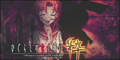


My sig = #1 Bwuahahahah XD
Obviously number one. Truly magnificent drawing skills that I posses.


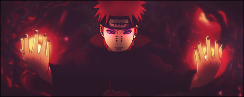
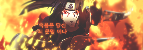


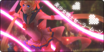
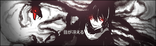
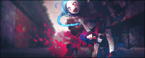
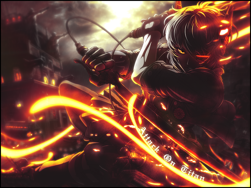
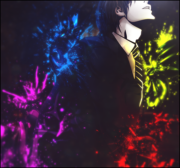
Whoa okay, your lighting still does not disappoint. You do an incredible job with it, and your Naruto banners are a complete testament to that. I love how the general darkness of the Pain banner calls attention to the focal points - his face and hands - and the fact that you were able to work with three focal points is pretty notable too, haha. As for the Itachi banner, the glow you added to the splatter looks great. I think some people overdo it at times, and the whole piece becomes messy and blurry as a result, but that definitely isn't the case here.
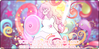
Also, the vectors you used for the Rose Quartz tag and [this tag] look very nice. Placement plays a huge part and you pull it off seamlessly. I wonder where you get these awesome vectors though. I normally don't use them a lot but whenever I want to I can never find ones that I like, haha.
Anyway, I also like what you did [here] with tiny text. It's such a classic technique tbh. It looks great!
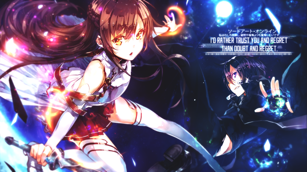
So yeah, the only bit of C+C I can provide is that the text placement seems awkward to me in the Kirito and Asuna piece. I feel like it would look better in the space on top of Asuna's leg/on Kirito's leg, so it calls attention to both of their faces. But then again, if that placement is what someone requested, I can't argue much about that. The customer IS always correct.
Also, the vectors you used for the Rose Quartz tag and [this tag] look very nice. Placement plays a huge part and you pull it off seamlessly. I wonder where you get these awesome vectors though. I normally don't use them a lot but whenever I want to I can never find ones that I like, haha.
Anyway, I also like what you did [here] with tiny text. It's such a classic technique tbh. It looks great!
So yeah, the only bit of C+C I can provide is that the text placement seems awkward to me in the Kirito and Asuna piece. I feel like it would look better in the space on top of Asuna's leg/on Kirito's leg, so it calls attention to both of their faces. But then again, if that placement is what someone requested, I can't argue much about that. The customer IS always correct.
Last edited:


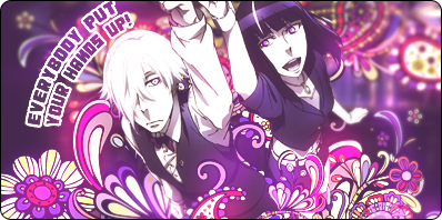
Ugh I just love your GFX's ~♡
Thank you!
Goddamnit, your lighting is pretty much always on point. I mean, what the hell? I have no idea how people can be this good at it.
Love the latest piece... as usual, really.
Much obliged, Derezzed. I tutor people on Skype if you ever want to learn some things from me.
") Really, amazing job. You never disappoint.
Really, amazing job. You never disappoint.


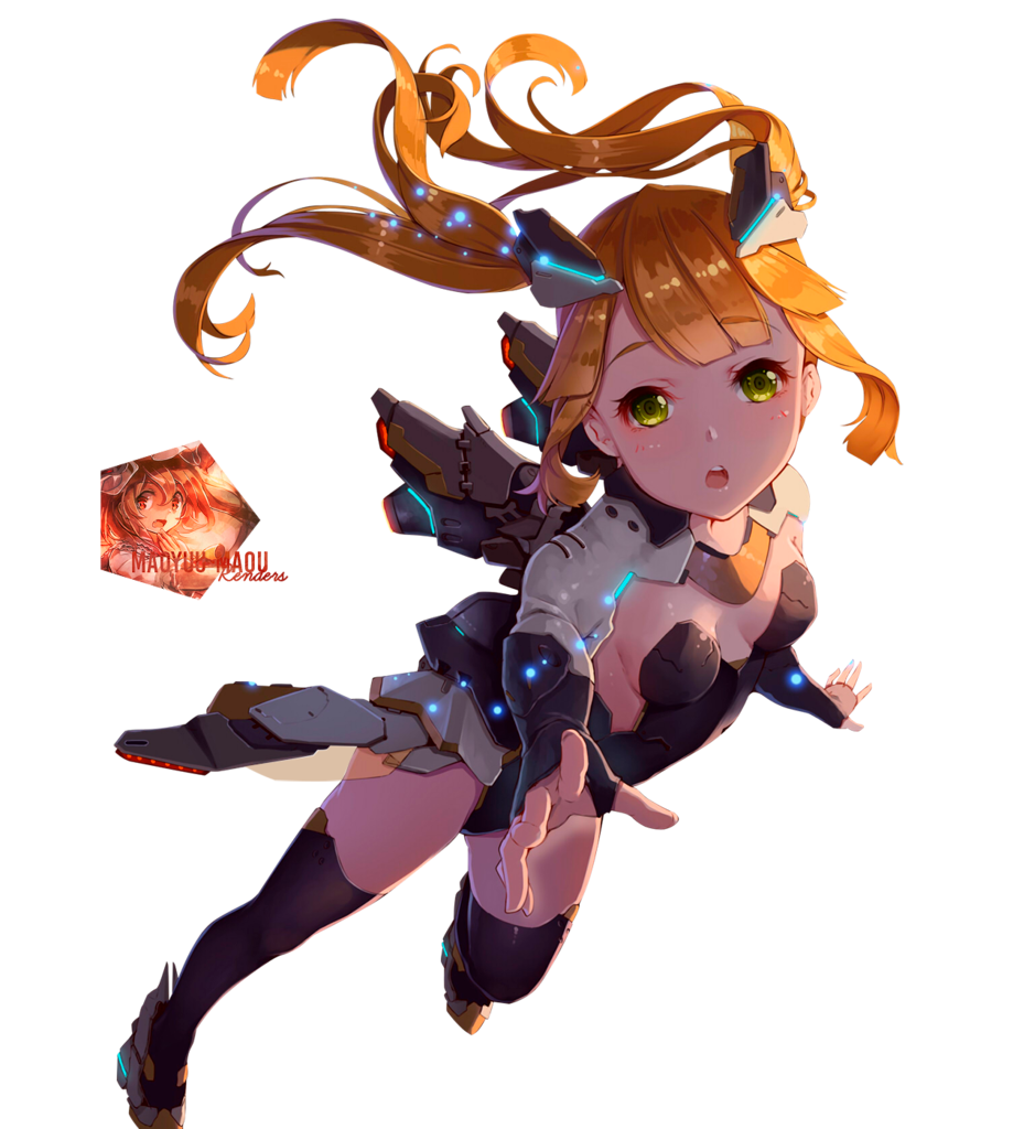
New Piece:
Render used:
Jesus god how
Similar threads
- Replies
- 75
- Views
- 3K
- Replies
- 3
- Views
- 499
- Replies
- 61
- Views
- 9K
- Replies
- 853
- Views
- 53K