I'll go ahead and critique your work, since I like when peeps do the same for me
 0-10 Anatomy Score
:
5/10
0-10 Landscape Score:
4/10
Ways to improve:
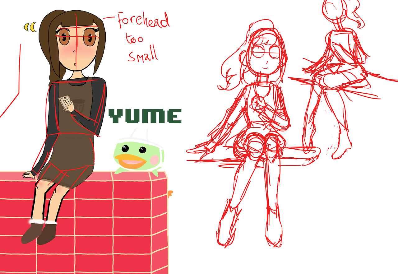
I'll start off with the anatomy. It looks pretty good but the proportioning is off. For example, the arms seem to taper down to the wrist so the hands appear to be very small, and the shoulders are a bit too flat coming from the base of the neck instead of curving from the base of the head. A good way to improve that skill would be to look at and study drawings that other people have made of human anatomy, that way you can see how the overall form works in different contexts. Also, it would be good to use/practice a gestural drawing (
like these) to help you get the overall form to be more proportional.
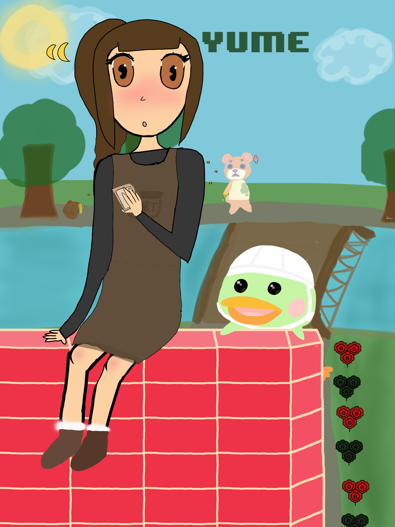
Next, I'll talk about the landscape. It has a nice, cartoon style to it, but there are a few things that don't seem right. For instance, the top of the tree looks transparent (as in, I can see where the trunk stops), and a good way to fix that would be to simply use a tool that doesn't make it look transparent (like a generic brush tool). The bridge in the background looks very flat, and so do the flowers. This can be helped by studying pictures of flowers and bridges, in the same way you would study anatomy. This will help you get a better understanding of the depth and form of these types of objects in a drawing. The clouds look okay, and so does the Sun in the sky, but as with the trees, they might look better if they weren't drawn with a transparent brush tool.
Any good things? (If there are):
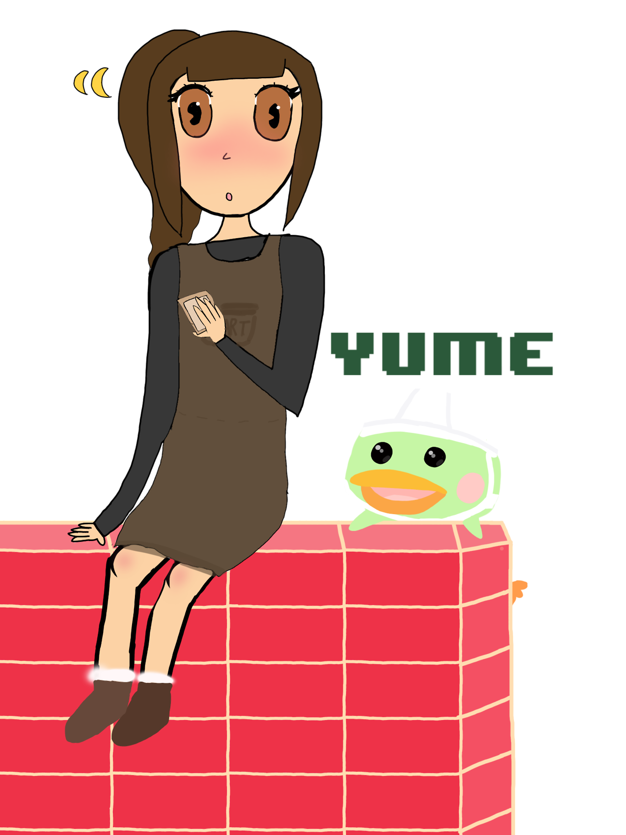
I like how you drew the villagers. They look very much like they do in the game, and have a nice feel to them.
Hope this helps! If you need some cartoon references that you'd like to study you can always check out my art in these folders: [
x] [
x] [
x] [
x]


")