May 19, 2009 #1 Resonate Senior Member Joined Jan 2, 2009 Posts 2,217 Bells 1,883 Thought I might as well finish up what I had started before moving onto any other work. I feel pretty happy with the outcome. :veryhappy: So Let me know what you think! Any Constructive Criticism is GREATLY Appreciated.
Thought I might as well finish up what I had started before moving onto any other work. I feel pretty happy with the outcome. :veryhappy: So Let me know what you think! Any Constructive Criticism is GREATLY Appreciated.
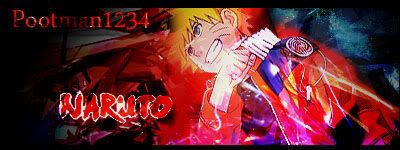
May 19, 2009 #2 P pikachu Senior Member Joined May 16, 2009 Posts 251 Bells 1,064 10000000000000000000000000/1 Whos that in the back though? D= Btw, change the font.
May 19, 2009 #3 Resonate Senior Member Joined Jan 2, 2009 Posts 2,217 Bells 1,883 pikachu said: 10000000000000000000000000/1 Whos that in the back though? D= Btw, change the font. Click to expand... In the back? ...Nobody except Naruto. =P
pikachu said: 10000000000000000000000000/1 Whos that in the back though? D= Btw, change the font. Click to expand... In the back? ...Nobody except Naruto. =P
May 19, 2009 #4 Princess bunny enthusiast Joined Nov 12, 2008 Posts 8,610 Bells 2,101 Switch 8418-5606-0111 It's Nice. "Believe it!" <small><small>wow cry...fail..
May 19, 2009 #5 Resonate Senior Member Joined Jan 2, 2009 Posts 2,217 Bells 1,883 cryindarkness said: It's Nice. "Believe it!" <small><small>wow cry...fail..</small></small> Click to expand... <small>Lol, Thank You.
cryindarkness said: It's Nice. "Believe it!" <small><small>wow cry...fail..</small></small> Click to expand... <small>Lol, Thank You.
May 19, 2009 #7 J John102 Senior Member Joined Jan 4, 2009 Posts 5,543 Bells 1,360 well, I think it's good, but I always give my negative opinion also, which may improve your sid, or I might not know what I'm talking about. anywayz. I think there's a little too much red, especially in the center of the siggie, right under Naruto's head, I mean, I just like a giant red dot.
well, I think it's good, but I always give my negative opinion also, which may improve your sid, or I might not know what I'm talking about. anywayz. I think there's a little too much red, especially in the center of the siggie, right under Naruto's head, I mean, I just like a giant red dot.
May 20, 2009 #8 F fullofmyself Senior Member Joined Mar 17, 2009 Posts 721 Bells 1,330 Text sucks imo, border is too big and the pink at the bottom is unattractive
May 20, 2009 #9 Trent the Paladin Retired Staff Joined Nov 7, 2006 Posts 17,519 Bells 0 Text doesn't fit.
May 20, 2009 #10 SamXX Senior Member Joined Dec 16, 2008 Posts 5,653 Bells 545 I'm fussy with text so that. Also too much red. I'm saying this because it'll improve you next time Decent attempt I must say.
I'm fussy with text so that. Also too much red. I'm saying this because it'll improve you next time Decent attempt I must say.
May 20, 2009 #11 Y YOUGETPWND Senior Member Joined Jan 28, 2009 Posts 145 Bells 1,317 its nice the only thing im not fond of is the way the text looks but great work keep it up


")


")