SilentHopes
Swag Master
Today, I have thought of many things, attempting to create inspiration for signatures. My past have failed. My present have failed. I have no idea what to create. I thought of those who made signatures from true undeniable inspiration, and then it hit me. You can make signatures about things, even if you don't what it is about, others may. So, I give to you, my toon link signature!
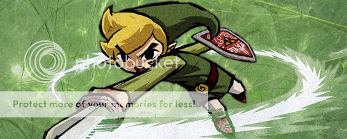
V1
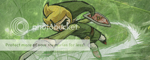
V2
V3
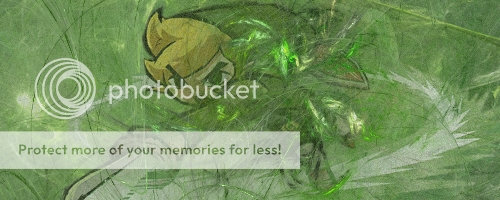
V4
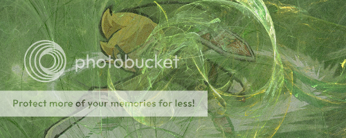
V5
I couldn't figure out which one looked best, so I'll leave it up to you guys. So, what do you think?
By the way, should I add text or not?
V1
V2
V3
V4
V5
I couldn't figure out which one looked best, so I'll leave it up to you guys. So, what do you think?
By the way, should I add text or not?


