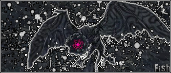
Yeah cant do too well with those nintendo.com renders... most of them are harder than dead people when it comes to cutting them... this one was lucky. D:
thanks guys. i like doing these spatter things, i'm going to try to make more brushes.
To be honest fish, I don't like the sig, and I'm a big fan of your work but this seems...like it had less effort put into it, the type of render you used wasn't a good idea because of the fade at its edges, you shouldn't magic wand it. Either proffesionally cut it with the pen tool, find a render of it, or feather it. Also I don't really like the BG for the reason thats its noo monochromatic, I wonder if a purple to white gradient mask on multiply or darken would have done the trick or maby a purple to white radial gradient on overlay behind the render. Either way all colours aside the BG is very nice but I'm not a huge fan of the sig.

")

