Super Smash Bros Amiibo Line Vs Super Mario Amiibo Line Design

Which Amiibo Line Has The Better Design?


  • Total voters
    30

Holla

Princess Daisy
Joined
Aug 17, 2013
Posts
10,433
Bells
263
Sky Clouds Scenery
Sky Clouds Scenery
Sky Clouds Scenery
Sky Clouds Scenery
Sky Clouds Scenery
Pink Hybrid Rose
Black Hybrid Rose
Gold Hybrid Rose
Black Hybrid Rose
Pink Hybrid Rose
Which Amiibo Line do you like better the Super Smash Bros or Super Mario, and why? I know in general the Smash line has a huge leg up with already being released and having way more of a variety of Characters, but design wise which series do you like better?


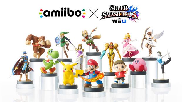
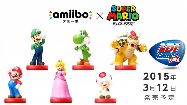
I personally prefer the Smash line even though I myself don't play Smash (at least for now, I might get Smash 3DS someday). The Super Mario Line is nice too, but the characters seem much more simple and plain. The Smash line is more creative and has some pretty sweet poses (Peach, Rosalina etc.) and some pretty odd poses (looking at you Luigi). The poses in the Mario Line are just meh in my opinion. The red coloured bases turn me off too, I greatly prefer the black and gold bases.
 
Last edited:
I like the Smash like because they have more characters, but the Super Mario line's amiibos look a little better to me. I prefer the amiibo didn't have those weird pieces of plastic stuck in them but I know they're needed for support. Since the Super Mario ones don't have those weird pieces of plastic I think they look better.

I'm going with the Super Mario line because this question is about design.
 
I prefer the Super Mario versions of Yoshi, Peach and Luigi.. neutral on both the Marios b/c I just hate looking at Mario at this point. Smash Bowser is better imo. But I agree the red bases aren't as attractive as the black/gold ones. I guess I have to go with the Smash line overall tho.
 
Comparing the exact characters from the Super Mario line to the Smash Bros. line (sans Toad, of course), the Super Mario line obviously falls flat.

But if they were to do more separate lines, there's some characters from the Smash Bros. line that need a better amiibo. Pikachu and Kirby look really bland. I get that for Kirby there's not much they could do (just look at Jigglypuff's SSB4 pose), but him just sitting there with a big grin on his face looks really crap when you consider it's from the same game and amiibo line as Mario dragging a fireball through the air.
 
I don't think they're entirely comparable, looking at only the characters that are in both lines of course.


Smash Bros tends to have the characters in game have a certain 'look' to them so that whilst they're all from different games, they still feel like they should be in Smash Bros. Like Mario looks more 'realistic' in Smash in the case of the material on his clothing, or Bowest looking more scaled and slightly darker.

Super Mario has the characters looking brighter and more 'friendly'.


Overall, I think it's more about which game/series aesthetic you prefer more. Even with the amiibo poses, some are lame and some are cool but they're still a pretty good representation of the character or a pose they actually do.

Actually as far as poses go, I think the SMW Amiibo are more 'true' to the characters. The Mario, Yoshi and Peach ones in particular are poses I've seen those characters in a number of times before.
The Smash Mario with the fire all and angry face? Sure, it looks cool...But it's not really how I view Mario.


Luigi's Smash amiibo looks horrible compared to the Super Mario World one though. It think that's something almost everybody can agree with.
 
Smash is better imo, but I like the Super Mario of Peach & Luigi better, and both Marios & DKs are pretty cool. It's really like comparing a Toyota to a Mercedes here.
 
Super Mario.

They're a lot more simpler than the smash amino, so there's less of a chance for then to look derped. Also not to mention, none of them have the cheap tacky plastic dildo holding them up (yet, anyway), so I really prefer the SM line to the SB line
 
Last edited:
I had a chance to compare the Bowsers. The Smash figures are detailed to look like the Smash characters and the Super Mario figures have the more cartoony style.

Nintendo does a really good job with figures which is great. Maybe not as good as Skylanders in terms of quality and detail but way better than Disney Infinity figures, which tend to have resin sticking out at odd places and being unpainted.


Edit: Needs a both option in the poll
 
Last edited:
Overall, i'd have to say the Super Smash Bros. line is way better than the Super Mario line. It's partly because the Smash line has more figures of different characters (Villager, Wii Fit Trainer, Pac-Man, etc.), but I just like these figures more. The Mario line's figures look very much like the generic poses you'd see in Mario official art. Sure, the Smash line has a lot of figures with ugly pieces of plastic, but overall, the figures look much nicer, in my opinion. However, I do think the Luigi figure in the Mario line looks better than the one in the Smash line, and I really like the Toad amiibo.

Also, I haven't seen anybody talk about this, but does anybody like the packaging for the Mario line? I know the packaging is the same as the Smash line, but i'm talking about the actual art behind the figure. I think the Mario line's art looks so ugly, to be completely honest. It's mostly the text that kills it for me, but I just don't like it. The Smash line packaging looks very cool, and I love how each character has a different color to identify them with (like Villager has dark green or Fox has dark blue).
 
Smash line, by far. They're much more interesting to look at.


Also, I haven't seen anybody talk about this, but does anybody like the packaging for the Mario line? I know the packaging is the same as the Smash line, but i'm talking about the actual art behind the figure. I think the Mario line's art looks so ugly, to be completely honest. It's mostly the text that kills it for me, but I just don't like it. The Smash line packaging looks very cool, and I love how each character has a different color to identify them with (like Villager has dark green or Fox has dark blue).

The Super Mario line uses colours too: e.g. Mario is red; Toad is blue. However, I do much prefer the Smash packaging: it looks so much more polished. I don't think that design would suit the Super Mario line as well though.
 
I voted for Super Mario but it's really a toss up. I prefer some from each line. The Smash Peach and Yoshi are better but I prefer the SM Luigi. The kicker is that I like all of the SM Amiibo (even if I prefer some Smash ones) wheras the Smash line has some that I really don't like (cough Luigi cough).
 
I voted for Super Mario but it's really a toss up. I prefer some from each line. The Smash Peach and Yoshi are better but I prefer the SM Luigi. The kicker is that I like all of the SM Amiibo (even if I prefer some Smash ones) wheras the Smash line has some that I really don't like (cough Luigi cough).

I understand the Smash Luigi hate, but he's kinda grown on me for that very reason. Weird right? I think the awkward pose suits him as he is a bit of an odd ball sometimes. I'm considering on getting the Smash Mario and Luigi sometime to go with Peach, Yoshi, Diddy Kong and Rosalina that I already have. I'm probably going to pass on Bowser, Donkey Kong and Wario though. They have nice Amiibos but they are just not my fave Mario Characters. I also have A Pikachu Amiibo but that's all I'm interested in as far a Pokemon go. Jiggypuff may be hard to resist though... Amiibos are addicting Jeez.
 
Last edited:
super mario line is the best in every way!!

I guess the only thing smash line has going for it is the larger variety of characters... but that's not really a valid point because then we're comparing games not the figures themselves
 
Back
Top