


Thoughts? Also, don't go *censored.4.1* about how bad the flow is, it's a stock signature causing the flow really hard to pull off. My thoughts: Eh.. seems empty at some parts. I love the gradient and stuff I put on it though.
This will be my last sig for quite a while, since I'll go on my usual GFX break.
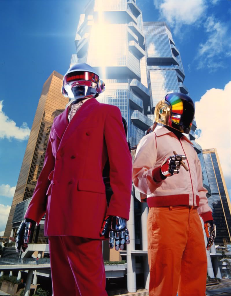
OH YEAH, and here's the original stock you can compare/contrast:
<div class='spoiler_toggle'>ORIGINAL STOCK IMAGE!</div><div class="spoiler" style="display:none;">

")


