I don't know if it's usual to post something like this on the forums, but let me do it anyway.
I?ve had the caf? unlocked for quite a while now and I still haven?t decided for a spot to place it. I already kind of know where I would like it to be, but I?m still doubting because of 1(!) grid row.


These are the options I was thinking about. The first one will have a little plaza of 4 by 5 patterns in front of it, that will align with the ones before re-tail and the town hall, the other one is directly next to the path. The gap that the second place creates in the path is kind of bothering me, but the first one feels so far away from the path. Anyway, both have their pro?s and con?s. I?m still unsure, but please tell me what you think looks best.
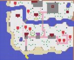
I?ll leave two versions of my town map in the spoiler, so you can see how it will blend in with the rest of the town.
I?ve had the caf? unlocked for quite a while now and I still haven?t decided for a spot to place it. I already kind of know where I would like it to be, but I?m still doubting because of 1(!) grid row.


These are the options I was thinking about. The first one will have a little plaza of 4 by 5 patterns in front of it, that will align with the ones before re-tail and the town hall, the other one is directly next to the path. The gap that the second place creates in the path is kind of bothering me, but the first one feels so far away from the path. Anyway, both have their pro?s and con?s. I?m still unsure, but please tell me what you think looks best.
I?ll leave two versions of my town map in the spoiler, so you can see how it will blend in with the rest of the town.

