-
 Eatser season is here! Here's what we have going on at The Bell Tree:
- The egg decorating contest is back! Join TBT’s Fifth Egg Decorating Contest, now with two distinct categories: decorating and painting. Entries must be submitted by April 9th.
- Starting this Friday at 7PM EDT, follow clues to search for eggs around the forum in TBT's Thirteenth Annual Easter Egg Hunt. New eggs will appear throughout the weekend and the hunt ends on April 6th!
- Customize your profile by spending bells on any of our three recurring backdrops.
You are using an out of date browser. It may not display this or other websites correctly.
You should upgrade or use an alternative browser.
You should upgrade or use an alternative browser.
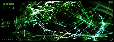
Abstract Fever Signature
- Thread starter NikoKing
- Start date


SilverCyrus
Senior Member
Nice Niko 8/10 it looks like its missing something, but it looks nice.
Comment...
Feels like it's all crowded near the middle top, then there's suddenly a hole near the center. The curve coming down from the top reveals the "hole" even more.
But if you were trying to go for this feel, then I suggest you reduce the amount of negative space on the left.
8/10 Since it's your first one! Good stuff Niko.
adorkable x
Senior Member
Edgy. 
9.6/10
9.6/10
Excellent. The colors you used mesh fantastically well together. I especially like the text and the blue shapes on the right of the screen that look like they are bursting out of the green. When I first looked at it, it gave me the feeling of space. (Idk why though, probably the alien green =p) I would've added in some small dots of green here and there to add a glow effect to the signature, but I guess that's just me.
So...yea. Nicely done man.")
So...yea. Nicely done man.


It's good, because it's not his first.Away236 said:Comment...
Feels like it's all crowded near the middle top, then there's suddenly a hole near the center. The curve coming down from the top reveals the "hole" even more.
But if you were trying to go for this feel, then I suggest you reduce the amount of negative space on the left.
8/10 Since it's your first one! Good stuff Niko.
Well, this IS my first abstract signature so I have no idea how you do it lol.Bacon Boy said:It's good, because it's not his first.Away236 said:Comment...
Feels like it's all crowded near the middle top, then there's suddenly a hole near the center. The curve coming down from the top reveals the "hole" even more.
But if you were trying to go for this feel, then I suggest you reduce the amount of negative space on the left.
8/10 Since it's your first one! Good stuff Niko.
Garrett x50 cal
Veteran AC Player


I love it! Can I use it?
Replied in PM about it ;0 .#Garrett said:I love it! Can I use it?
Yea, I meant his first abstract sig =PNikoking said:Well, this IS my first abstract signature so I have no idea how you do it lol.Bacon Boy said:It's good, because it's not his first.Away236 said:Comment...
Feels like it's all crowded near the middle top, then there's suddenly a hole near the center. The curve coming down from the top reveals the "hole" even more.
But if you were trying to go for this feel, then I suggest you reduce the amount of negative space on the left.
8/10 Since it's your first one! Good stuff Niko.


Lol, this is my first abstract signature Jas0n. Oh, and how have you been?Jas0n said:


bittermeat
Senior Member
The abstract fever font is nice, but the Niko font is horrible. The signature is way over contrasted and I did not recieve that abstract touch from it.
flabbergasted
Senior Member
it reminds me of...the matrix XD
9/10. awesome
9/10. awesome
Similar threads
- Replies
- 28
- Views
- 2K