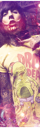
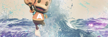
AiAi stands out too much and the light blue water pieces that are flying out of the water stand out too much as well. You could have moved AiAi down a bit so we could see more of his face. Right now, the main focal is the A on his shirt.
Back to my first point, removing AiAi from this sig altogether would have looked a lot better than it currently does.
Damn, :L .
1st one doesn't have a lot of depth.
2nd one has the same depth issue.
3rd one is the best out of them all .
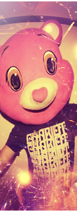
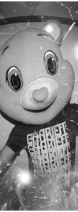
4th/5th are too squished imo.
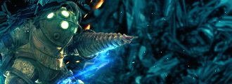
6th one has a bad focal point placement.
1. The first tag is an interesting concept...but it really wasn't implemented well. Lighting could use a lot of work. Depth could as well.
2. This one is the worst out of the bunch, in my opinion. The render is way too small leaving too much deadspace in the outlying areas. Kind of boring with nothing that attracts the eye to it.
3. Really digging this one. Did you put the blood on his face or was it already in the photo? Anyways the lighting is just awesome, C4Ds could have probably been put on Normal rather than Screen to give the tag more substance if you know what I mean. Depth could use a little tweaking but it's alright. A bit hard to identify the direction of flow. But nice job.
4. I like it. I agree with Niko in the fact that it looks a bit squished. However some of the stray lines from the c4ds you used are on his face/head/mask? which don't look too good. Have you made a smudging tag before? This would make for a cool one.
5. Keep it in color.
6. I like it. However I think the depth could use a lot of work as I can clearly make out the water in the front of the tag as well as in the back. One of them should be harder to see. (preferably the back part) The color scheme is cool, but I'm not into that off-white background. Maybe you could color the background to match his backpack straps? Just desaturate the color a bit so it doesn't distract from the focal.


 .
.