-
Happy Earth Week! TBT is hosting a series of nature-based mini-events through April 28th. Breed flower hybrids by organizing your collectible lineup, enter our nature photography contest, purchase historically dated scenery collectibles, and earn bells around the site! Read more in the Earth Week and photography contest threads.
You are using an out of date browser. It may not display this or other websites correctly.
You should upgrade or use an alternative browser.
You should upgrade or use an alternative browser.
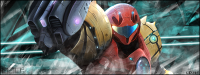
Samus Signature
- Thread starter Lewis
- Start date
evilpancakes
Senior Member
Dude, you are like the Davinci with siggys
Lol ^^evilpancakes said:Dude, you are like the Davinci with siggys


I wouldn't say so, Go too wiifriends and check out Maniac's sigs. They're godlike.evilpancakes said:Dude, you are like the Davinci with siggys
Anyways, I love it. You've improved highly. 9.5/10 (And this is coming from a strict reviewer ^_^)
that would be either ultrabyte of chubsterrevilpancakes said:Dude, you are like the Davinci with siggys
Thank you very much, I appreciate it ^^Nikoking said:I wouldn't say so, Go too wiifriends and check out Maniac's sigs. They're godlike.evilpancakes said:Dude, you are like the Davinci with siggys
Anyways, I love it. You've improved highly. 9.5/10 (And this is coming from a strict reviewer ^_^)


Ty, I see .bored postingmirandi said:Nice job Lewigi!! I like it!! 10/10

Colors are bad, render is over-blended(lost in the background), effects are generic, bad lighting, text isn't as atrocious as last time but still bad, and what's with pointless squares in the corner?
I'd suggest looking up some tutorials or something. Learn some new techniques.
I'd suggest looking up some tutorials or something. Learn some new techniques.
The 'pointless squares' are my signature brush..bored said:Colors are bad, render is over-blended(lost in the background), effects are generic, bad lighting, text isn't as atrocious as last time but still bad, and what's with pointless squares in the corner?
horribly noticeable text?.bored said:I don't really think you need a personal touch in each of your sigs with the horribly noticeable text.
Great constructive criticism..bored said:I don't really think you need a personal touch in each of your sigs with the horribly noticeable text.
/sarcasm
Not everybodies skill-lacking ^^.bored said:iknorite? It's not like he's going to get any from this group of skill-lacking noobs.
Chubster helped me..bored said:Well nobody with skill is helping you guys.
Similar threads
- Replies
- 18
- Views
- 614
- Replies
- 9
- Views
- 154
- Replies
- 8
- Views
- 280