Pokémon Which Form of this New Pokemon do you Prefer?

Which Form Do You Prefer?

  • Low Key Form

    Votes: 5 35.7%
  • Amped Form

    Votes: 9 64.3%

  • Total voters
    14

Holla

Salmon Runnin’
Joined
Aug 17, 2013
Posts
10,526
Bells
137
Countdown Coins
0
Lucky Tickets
0
White Star Fragment
Magnesian Rose Star Fragment
Gilded Copper Star Fragment
Scorching Sodium Star Fragment
Lithium Sky Star Fragment
Lost Star Fragment 004.MB
Lost Star Fragment 002.AN
International Space Cetacean Star Fragment
Galaxolotl Star Fragment
White Star Fragment
This is a small spoiler for Toxel's evolution so if you don't want to see it do not open the spoiler below. For those that don't mind spoilers or already know about it's evolution please feel free open the spoiler to help you make a decision.
So this cute little guy called Toxel:
Toxel_EpEc.png

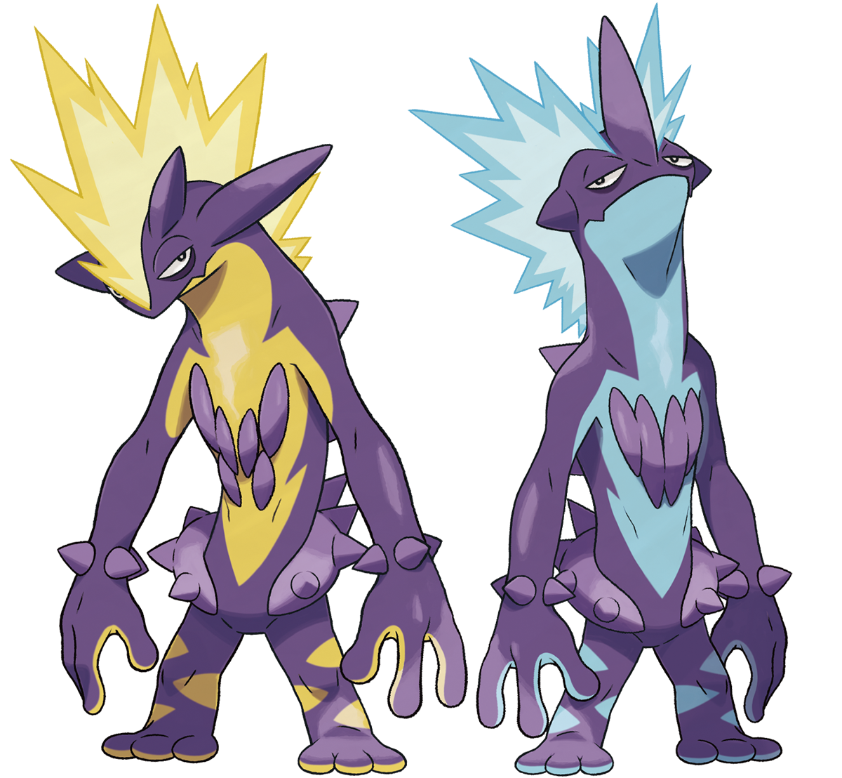
Evolves into one of these super cool looking guys depending on it's nature:
Toxtricity.png

I'm just curious which form you personally prefer? (Left is Low Key form, right is Amped)
 
Last edited:
Amped form.

I actually have this in my team.

I just prefer the contrast of purple/yellow. Purple/blue are too close, the detail isn't immediately obvious and the Pokemon generally just stands out less.
 
What I find hilarious is I literally sketched toxel's
gigantimax form
in a colour accurate way last year (I was drawing monsters for fun) cuz I call that use of colour "toxic" (in a toxic slime kinda way)
 
Amped form.

I actually have this in my team.

I just prefer the contrast of purple/yellow. Purple/blue are too close, the detail isn't immediately obvious and the Pokemon generally just stands out less.

I definitely have to agree the yellow makes for a much better contrast that's for sure
 
Yeah, I really prefer the Amped form as it just looks better, imo (and I have Amped form Toxtricity on my team at the moment).
 
I don't know so much about this Pokemon, but out of the two forms, I find the Amped form from it's look better than the other one.
 
Definitely Amped. I think Low Key (the colors) would benefit from a much more different design.
 
Last edited:
Back
Top