You are using an out of date browser. It may not display this or other websites correctly.
You should upgrade or use an alternative browser.
You should upgrade or use an alternative browser.
RobotCrazyMe
- Thread starter Tyler
- Start date

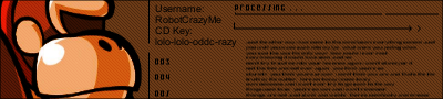
Propaganda Man
Senior Member
The background kills it.
flabbergasted
Senior Member
i'd lighten up the backround a little bit.
YogurtBandit
Senior Member
Unreadbable Text= Bad


You've uhhh, you've become quite the critic recently :/ ..YogurtBandit said:Unreadbable Text= Bad
Anyway, the sig is alright. I suggest maybe using a lighter type of brown for the backround, it looks a bit too dark compared to DK (then again, it could be my computers' brightness or something..)
Nothing wrong with being a critic... D=Gengar said:You've uhhh, you've become quite the critic recently :/ ..YogurtBandit said:Unreadbable Text= Bad
YogurtBandit
Senior Member
I would say Cut some stuff out of the text and then Make the text larger, if possible.OddCrazyMe said:Nothing wrong with being a critic... D=Gengar said:You've uhhh, you've become quite the critic recently :/ ..YogurtBandit said:Unreadbable Text= Bad
Propaganda Man
Senior Member
The sig is called robotcrazyme. You are supposed to read that partUltraByte said:<_<YogurtBandit said:Unreadbable Text= Bad
Tech sigs are supposed to be like that.
")
Propaganda Man
Senior Member
Do both.UltraByte said:Either lighten the bg up (like what 12341234127304891720984 other people said), or maybe.... brush up a bg? *is shot*
Muuuch better!OddCrazyMe said:Okay I think I have enough info for Version 2.
")
v2
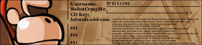
8.5/10
Propaganda Man
Senior Member
Its good. 7/10. But it would be foolish to think that its one of the best.
Similar threads
- Replies
- 12
- Views
- 888
- Replies
- 1
- Views
- 349
- Replies
- 0
- Views
- 137