

I got into sig making and improved alot.. I'm still improving though, I plan on becoming good like Crash.  Maybe better... Kidding.
Let's see, my style is pretty much mixed between these three tutorials I've seen. As I said, I'm still improving so I'm looking for more tutorials.
I'm still experimenting in lighting and trying out c4ds, but in my newest sigs, I've been using stocks.
By the way, I use Gimp.
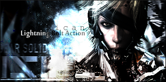
Recently (In order):

(^First one made in months)


(^*Ver3 This sig was pretty much screwed at first, When I was working on this sig, I had to restart my computer, so I was going to save it as xcf, but I accidentally saved it as .png. and turned off the comp. When I turned my computer back on, I noticed it was saved as .png, I panicked and began to look for the .xcf but could not find it. So I couldn't really do anything to this sig other than add text and a border.) tl;dr
Newest:
---
Constructive Criticism is welcomed. :0
Maybe better... Kidding.Let's see, my style is pretty much mixed between these three tutorials I've seen. As I said, I'm still improving so I'm looking for more tutorials.
I'm still experimenting in lighting and trying out c4ds, but in my newest sigs, I've been using stocks.
By the way, I use Gimp.
Recently (In order):
(^First one made in months)
(^*Ver3 This sig was pretty much screwed at first, When I was working on this sig, I had to restart my computer, so I was going to save it as xcf, but I accidentally saved it as .png. and turned off the comp. When I turned my computer back on, I noticed it was saved as .png, I panicked and began to look for the .xcf but could not find it. So I couldn't really do anything to this sig other than add text and a border.) tl;dr
Newest:
---
Constructive Criticism is welcomed. :0


