Follow along with the video below to see how to install our site as a web app on your home screen.
Note: This feature may not be available in some browsers.
TBT is celebrating the start of the Year of the Horse! Our latest event, TBT's Lunar New Year for 2026, is now underway! Meanwhile, we invite you to share your feedback for the forum in the February 2026 Survey. Thank you!
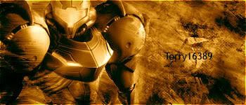
okay I have one MAJOR problem with the sig. its all one colour. Use gradient maps on soft light or on low opacity to give it a different colour but while keeping the basic colours and shades. Otherwise its quite sexy.
Oh also work on making text a bit less boring (more colours and different font and whatnot) and saving it at a higher quality)
See, I tried the Gradient Map thing JJ, but I can't seem to figure out which colors go best together. And the text, well...I just wanted to keep it simple, ya know?