You are using an out of date browser. It may not display this or other websites correctly.
You should upgrade or use an alternative browser.
You should upgrade or use an alternative browser.
Improved Realism!
- Thread starter biibii
- Start date


timecapsule
Senior Member


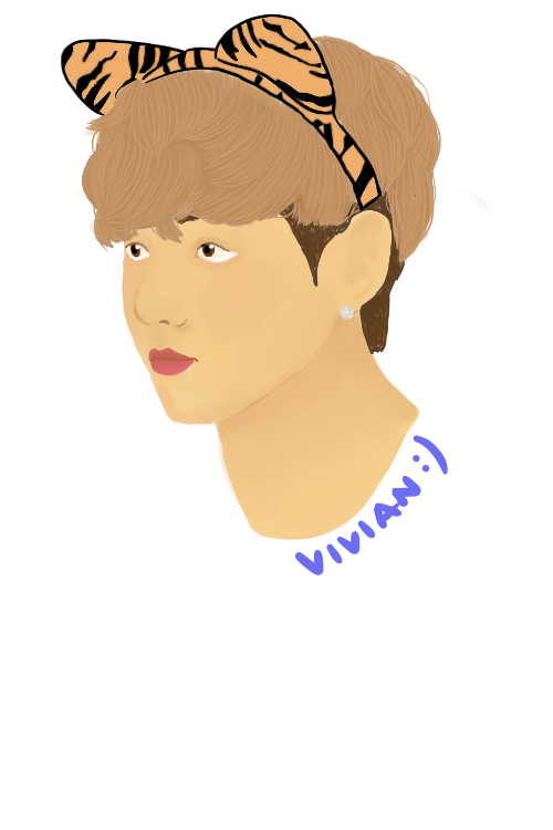
lol he doesn't look pale to me. I like it. My only suggestion is to make the eyes bigger, it looks a tiny bit odd to me, but that's probably my craziness XD
It looks really nice!
It looks really nice!
Mega_Cabbage
Meh


I don't think he's too pale. He just needs more defined shading. I can barely see the contrast on the ear.
timecapsule
Senior Member
I don't think he's too pale. He just needs more defined shading. I can barely see the contrast on the ear.
EXACTLY THANK YOU
I wasn't sure how I was to describe his.. matte? look. So I didn't add it, lol. This is the best way to describe it though
Last edited:
//whispers// hes Korean lmaolol he doesn't look pale to me. I like it. My only suggestion is to make the eyes bigger, it looks a tiny bit odd to me, but that's probably my craziness XD
It looks really nice!
timecapsule
Senior Member
//whispers// hes Korean lmao
XD sorry. I guess I don't see a lot of Korean people?
Anyways just do what you want to with it ^^
That Zephyr Guy
crouton.net


Despite being korean he still lacks the aforementioned shading. You can see it most definitively in the hair and the ear. Use more blacks. Darken the shaded areas tremendously. If it seems like too much, it's probably edging a good amount.
It'll feel weird to do but it'll look super nice.
It'll feel weird to do but it'll look super nice.
Despite being korean he still lacks the aforementioned shading. You can see it most definitively in the hair and the ear. Use more blacks. Darken the shaded areas tremendously. If it seems like too much, it's probably edging a good amount.
It'll feel weird to do but it'll look super nice.
ahh I was talking about the eyes. im gonna try using a dark dark shade in the crevices :_)
Veggiesaurus
Senior Member
The proportions look good to me, but as everyone else has mentioned I would really push in some dark values to give the face some depth. Right now it looks kind of flat and undefined and unfinished. But the bones are there, just needs to really up the contrast. It can be scary at first (I used to have the same problem) because you naturally kind of shy away from putting really dark areas on light skinned people, but they are there. What kind of helped me was opening up a few photographs in photoshop and sampling colors to see how dark the shadows truly are when singled out. Another trick is to temporarily switch your picture from color to greyscale and you should be able to see a full range in shading from really dark to very light. If it doesn't work in greyscale or look like it has enough range of darkness/lightness, you need to add more in the color version. Switching back and forth like that really helped me get a better grasp of shading and lose my fear of really getting those dark tones in. That said, I do think this is an improvement over your last portraits you posted, you are definitely getting there!
Last edited:


pickle inkii.
BUT HOW CAN I DO THAT
Yeah, the shading could use a bit of work.
But other than that...
WOWEEEEEEEE
YOU ARE GOD
But other than that...
WOWEEEEEEEE
YOU ARE GOD
Yeah, the shading could use a bit of work.
But other than that...
WOWEEEEEEEE
YOU ARE GOD
no. don't compliment traced artwork.
no. don't compliment traced artwork.
if it was traced it would have lines no? plus its disproportionate in some areas, so that means that i used a reference, not directly traced
")
if it was traced it would have lines no? plus its disproportionate in some areas, so that means that i used a reference, not directly traced
LOL no it wouldn't necessarily have lines. the disparity in anatomy and coloring skill is how it's so obvious.
Nightmares
( ̄。 ̄)~zzz


LOL no it wouldn't necessarily have lines. the disparity in anatomy and coloring skill is how it's so obvious.
Shouldn't the disparity in anatomy show that it's not traced? idk
Shouldn't the disparity in anatomy show that it's not traced? idk
no....because what i'm saying is the anatomy is too good for the coloring,,,
That Zephyr Guy
crouton.net
I mean you can be ass at coloring but still get a lot of leeway for the anatomy from a reference.
It's way easier to interpret shapes than it is blends of colors.
Besides if they are tracing, they're only hurting themselves, so it's better to just give them the benefit of the doubt.
It's way easier to interpret shapes than it is blends of colors.
Besides if they are tracing, they're only hurting themselves, so it's better to just give them the benefit of the doubt.
That Zephyr Guy
crouton.net
-Shrug- I too draw far better when I'm face first in a reference that I'm attempting to recreate.
Similar threads
- Replies
- 2
- Views
- 211
- Replies
- 1
- Views
- 193
- Replies
- 5
- Views
- 421