Feedback for my Studio Ghibli themed town?

Disneyfangirl23

Senior Member
Joined
Jan 3, 2014
Posts
10,128
Bells
3
Island
???
Isabelle
Blue Bunny Balloon
Sweet Bunny Balloon
Red Bunny Balloon
White Rose
Yellow Rose
Leif
Bee Plush
My Melody Easter Egg
Apple (Fruit)
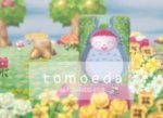
My Town has a Studio Ghibli theme. So I was just wondering if anyone would be able to give me feedback for it.

My dream address is 7C00-00DD-E028 and my Town is Tomoeda. :)
 
Last edited:
sorry I can't really offer the best advice but since no one else was commenting I thought I would give your D.A a look.
I thought the inside of the houses were very cute 10/10 I just didn't like the outdoors, the flower colors didn't really seem to go with the look of the town and i think the paths might of been set up wrong? i could be wrong but for example
screenshot HERE
you see the path pattern you used to go down (like a walking path i assume?) and it has a bunch of the green grass/moss on the right side of it but then the path pattern more upwards is opposite, it has that grassy stuff more bundled up on the left side I would think they're supposed to go side by side. this might be the exact path ur using, looks like it atleast -> HERE see how they have it side by side? that's what i mean (it's better to see it then me try to explain bahaha) but ofc it's your town and I don't know what look your going for or if you intended to do it that way ya kno? so if that's what you wanted to do then nothing wrong w/ it at all. as I said earlier i love the inside of your houses I def get a studio ghibli vibe from them c:

I know the paths look different but I did want to use the paths I have, but I’m glad you like my town~ ^^
 
I'll take a look when I get off work today :D

I don't know much of Studio Ghibli other than Kiki's Delivery Service because I watched that movie a lot as a kid but my sister is a fanatic so I've learned a few things and I look forward to seeing your town!
 
I'll take a look when I get off work today :D

I don't know much of Studio Ghibli other than Kiki's Delivery Service because I watched that movie a lot as a kid but my sister is a fanatic so I've learned a few things and I look forward to seeing your town!

Sounds good! I hope you enjoy it~ ^^
 
First impressions:
The wooden boards that you used around the town tree seem rather harsh and aren't connected properly. There's also the blank space from the last traveling NPC there which breaks any theme you were going for. I would suggest making sure that the town is clean and a bit more presentable before creating a dream address for it - after all, it's like a perfect snapshot for your world... be proud of it!

Moving about the town:
There's a lot of open room and open potential along the pathways and between the buildings. I'm not sure how I feel about the clovers randomly dropped in the pathways as it makes the walkways feel even more hap-hazard. With they style of walkways you're going for, it really feels like something more along the lines of stepping stones is what you want for your paths. The Totoro Pattern on the ground around Sakura's house is a bit abrupt and really felt out of place.

The houses:
The two smaller ones have a lot of work to go however judging by Satuki's house I'm sure they'll be wonderful!

Final words:
I really feel like what I'm looking at is an underdeveloped town that hasn't quite come to terms with itself. While I'm not an expert on Studio Ghibli films, from what I can remember and google images from films the style feels very dream-like with soft pastels and a bit of a focus on pinks, yellows, blues, and greens. I would suggest keeping that in mind while you work on the landscaping and the flower choices you make.

I hope this helps you with really making this town shine!
 
I visited your town for the last 20 minutes or so. Because I can see that you're looking for(but unfortunately not receiving) a lot of feedback, this is going to be an extensive review. I'm gonna go over what my impressions were and give some suggestions, if that's ok. And if it's not, then I apologize in advance.

Ok, so first thing's first: as other people have mentioned, your tiles are mismatched. I won't go too much into that, except to say that the disjointed style is visually distracting from what seems to be a pretty decent town. I noticed that a few of the tiles were actually set properly. So I take it that you DO have the right patterns for them; you only need to fix them so that they're set correctly.

As far as your Studio Ghibli theme, I don't know much about Ghibli at all, and since I can't comment on anything in regards to that style, I'm going within the context of what I currently see, as it's presented:

Sakura's house is really nice! Visually, it's very cute and I love the wall/floor! I can't really say if you should match all three floors, if that's not they style you're going for, but I think the top and middle floors of this house are very good. The basement is good also, but the top two floors stand out to me more because they share a common theme.

Chihiro's house is really good and the setup is quite solid. It works well, and looks pretty cozy!

Kiki's house is cute! It's nicely put together and I love the patterns!

Satsuki's house is well very well done! I can't shake the feeling that it's incomplete, but given that I don't know much about studio Ghibli, this house is great! All of the rooms are cute and I love the customizations! I especially thought the basement was really nice!
Overall, with what's presented at face-value, your homes get a 10/10. Even though I know I'm missing a lot of the context with the Ghibli theme, what's presented is just so freaking cute and very well put together, and I'm sure the three smaller houses will be even better once expanded, if Satsuki's house is anything to go by.

As for the rest of your town, it looks to me like you have a few problems outside of the mismatched path patterns.
For one, your houses are built in challenging spots that seem hard for you to work around. Not saying it can't be done, just that you didn't really make it easy for yourself. For example, Sakura's house is built right in the middle of a semi-island, across the river from the villager Kiki. What would have made sense, is that a bridge would be directly in front of Sakura's house. But instead it's on the side in a very awkward position that's hard to work around, and her house abruptly appears when you cross the bridge. And because Kiki has her home in front of where a bridge should be, you can't place it there either. Villager home placement I can understand, because everyone has an issue with that, but you need to consider how your player homes are placed and what you can do to accentuate them, rather than have their locations drag down the overall aesthetic of your town.

Another thing, is that quite a few of your patterns aren't well placed, and I'm not talking about your path patterns, since you already know the problems with that. For example, the pattern around Sakura's house is kind of abrupt. Like bam! Out of nowhere, a pattern. Now, if that's how you want it, then it's fine. But as a visitor, it looks and feels very out of place. It's definitely a cute pattern, but you need to find a way to work it in, so that it adds to the style of your town.

Another thing is your flowers. Some of them are well arranged, but the rest could use a little more cohesion when it comes to their decoration. Now you DON'T have to do this, but I'm saying it since you're going for a themed town. The three things you want to keep in mind when it comes to flower arrangements for themed towns is style, color, and consistency. You don't have to have all three, but try to coordinate and mix them around to find what works for you. Going through your town, it looks like you started on those ideas in some areas(like the path area around Satsuki's house), but then eventually...you just gave up. Now if that's how you want your flowers arranged, then it's fine. But as a visitor, a lot of the row arrangements came off to me as disparate, uncoordinated, and kind of messy.

As for your pwp's, the placements aren't bad at all. But with the way your town is set up, they also feel very scant.

Overall, your town looked very incomplete. But that's not a bad thing at all! It just means that you have plenty of room to experiment and try new things! What I would suggest you do, since you're building your town around a very specific theme(Ghibli): visit towns that have the same, or similar theme as the one you want to use. Find out what worked for them, and adapt those concepts to your own style to build the town that you want. DON'T COPY THEM OUTRIGHT. Adapt. In other words, take note of the ideas they put together, use them as examples to build your own personal style, and then create the town with the theme you chose using your own style and flair.

So that's my review of your town. Overall, I can definitely see the potential for your town, especially through the houses you put together. You just need to work at it and flesh out your ideas a little more. :)
 
sorry I can't really offer the best advice but since no one else was commenting I thought I would give your D.A a look.
I thought the inside of the houses were very cute 10/10 I just didn't like the outdoors, the flower colors didn't really seem to go with the look of the town and i think the paths might of been set up wrong? i could be wrong but for example
screenshot HERE
you see the path pattern you used to go down (like a walking path i assume?) and it has a bunch of the green grass/moss on the right side of it but then the path pattern more upwards is opposite, it has that grassy stuff more bundled up on the left side I would think they're supposed to go side by side. this might be the exact path ur using, looks like it atleast -> HERE see how they have it side by side? that's what i mean (it's better to see it then me try to explain bahaha) but ofc it's your town and I don't know what look your going for or if you intended to do it that way ya kno? so if that's what you wanted to do then nothing wrong w/ it at all. as I said earlier i love the inside of your houses I def get a studio ghibli vibe from them c:

The Dream Address has been updated~

- - - Post Merge - - -

First impressions:
The wooden boards that you used around the town tree seem rather harsh and aren't connected properly. There's also the blank space from the last traveling NPC there which breaks any theme you were going for. I would suggest making sure that the town is clean and a bit more presentable before creating a dream address for it - after all, it's like a perfect snapshot for your world... be proud of it!

Moving about the town:
There's a lot of open room and open potential along the pathways and between the buildings. I'm not sure how I feel about the clovers randomly dropped in the pathways as it makes the walkways feel even more hap-hazard. With they style of walkways you're going for, it really feels like something more along the lines of stepping stones is what you want for your paths. The Totoro Pattern on the ground around Sakura's house is a bit abrupt and really felt out of place.

The houses:
The two smaller ones have a lot of work to go however judging by Satuki's house I'm sure they'll be wonderful!

Final words:
I really feel like what I'm looking at is an underdeveloped town that hasn't quite come to terms with itself. While I'm not an expert on Studio Ghibli films, from what I can remember and google images from films the style feels very dream-like with soft pastels and a bit of a focus on pinks, yellows, blues, and greens. I would suggest keeping that in mind while you work on the landscaping and the flower choices you make.

I hope this helps you with really making this town shine!

The Dream Address has been updated~

- - - Post Merge - - -

I visited your town for the last 20 minutes or so. Because I can see that you're looking for(but unfortunately not receiving) a lot of feedback, this is going to be an extensive review. I'm gonna go over what my impressions were and give some suggestions, if that's ok. And if it's not, then I apologize in advance.

Ok, so first thing's first: as other people have mentioned, your tiles are mismatched. I won't go too much into that, except to say that the disjointed style is visually distracting from what seems to be a pretty decent town. I noticed that a few of the tiles were actually set properly. So I take it that you DO have the right patterns for them; you only need to fix them so that they're set correctly.

As far as your Studio Ghibli theme, I don't know much about Ghibli at all, and since I can't comment on anything in regards to that style, I'm going within the context of what I currently see, as it's presented:

Sakura's house is really nice! Visually, it's very cute and I love the wall/floor! I can't really say if you should match all three floors, if that's not they style you're going for, but I think the top and middle floors of this house are very good. The basement is good also, but the top two floors stand out to me more because they share a common theme.

Chihiro's house is really good and the setup is quite solid. It works well, and looks pretty cozy!

Kiki's house is cute! It's nicely put together and I love the patterns!

Satsuki's house is well very well done! I can't shake the feeling that it's incomplete, but given that I don't know much about studio Ghibli, this house is great! All of the rooms are cute and I love the customizations! I especially thought the basement was really nice!
Overall, with what's presented at face-value, your homes get a 10/10. Even though I know I'm missing a lot of the context with the Ghibli theme, what's presented is just so freaking cute and very well put together, and I'm sure the three smaller houses will be even better once expanded, if Satsuki's house is anything to go by.

As for the rest of your town, it looks to me like you have a few problems outside of the mismatched path patterns.
For one, your houses are built in challenging spots that seem hard for you to work around. Not saying it can't be done, just that you didn't really make it easy for yourself. For example, Sakura's house is built right in the middle of a semi-island, across the river from the villager Kiki. What would have made sense, is that a bridge would be directly in front of Sakura's house. But instead it's on the side in a very awkward position that's hard to work around, and her house abruptly appears when you cross the bridge. And because Kiki has her home in front of where a bridge should be, you can't place it there either. Villager home placement I can understand, because everyone has an issue with that, but you need to consider how your player homes are placed and what you can do to accentuate them, rather than have their locations drag down the overall aesthetic of your town.

Another thing, is that quite a few of your patterns aren't well placed, and I'm not talking about your path patterns, since you already know the problems with that. For example, the pattern around Sakura's house is kind of abrupt. Like bam! Out of nowhere, a pattern. Now, if that's how you want it, then it's fine. But as a visitor, it looks and feels very out of place. It's definitely a cute pattern, but you need to find a way to work it in, so that it adds to the style of your town.

Another thing is your flowers. Some of them are well arranged, but the rest could use a little more cohesion when it comes to their decoration. Now you DON'T have to do this, but I'm saying it since you're going for a themed town. The three things you want to keep in mind when it comes to flower arrangements for themed towns is style, color, and consistency. You don't have to have all three, but try to coordinate and mix them around to find what works for you. Going through your town, it looks like you started on those ideas in some areas(like the path area around Satsuki's house), but then eventually...you just gave up. Now if that's how you want your flowers arranged, then it's fine. But as a visitor, a lot of the row arrangements came off to me as disparate, uncoordinated, and kind of messy.

As for your pwp's, the placements aren't bad at all. But with the way your town is set up, they also feel very scant.

Overall, your town looked very incomplete. But that's not a bad thing at all! It just means that you have plenty of room to experiment and try new things! What I would suggest you do, since you're building your town around a very specific theme(Ghibli): visit towns that have the same, or similar theme as the one you want to use. Find out what worked for them, and adapt those concepts to your own style to build the town that you want. DON'T COPY THEM OUTRIGHT. Adapt. In other words, take note of the ideas they put together, use them as examples to build your own personal style, and then create the town with the theme you chose using your own style and flair.

So that's my review of your town. Overall, I can definitely see the potential for your town, especially through the houses you put together. You just need to work at it and flesh out your ideas a little more. :)

The Dream Address has been updated~
 
F9ED2E02-8DFC-4412-991A-B2452D097F02.jpg

Tomoeda has been updated but it still needs work ~
 
Back
Top