marierock13
Senior Member

Um, hi.
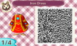
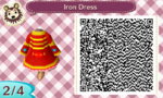
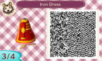
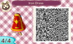
Here are the QR codes for a dress that I designed.
This is the 'Iron Dress', which is a take on the Iron Man suit, but as a cute dress. This was inspired by the Avengers movie.
So, tell me what you think, hmm? Hope that this was worth sharing!
Cheers,
~ Marie
Here are the QR codes for a dress that I designed.
This is the 'Iron Dress', which is a take on the Iron Man suit, but as a cute dress. This was inspired by the Avengers movie.
So, tell me what you think, hmm? Hope that this was worth sharing!
Cheers,
~ Marie