You are using an out of date browser. It may not display this or other websites correctly.
You should upgrade or use an alternative browser.
You should upgrade or use an alternative browser.
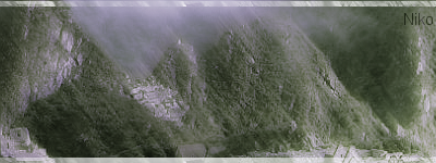
Mountain Stock Signature
- Thread starter NikoKing
- Start date


technoxmaniac
Senior Member

Awesome!
8/10
8/10
Heh, thanks for the feedback.technoxmaniac said:Awesome!
8/10
Also on another note, don't think I pasted a picture and put on border and text and call it good <_< . I spent the last 3 hours on this sig trying to perfect it with flow and other things.
technoxmaniac
Senior Member
lol ok.Nikoking said:Heh, thanks for the feedback.technoxmaniac said:Awesome!
8/10
Also on another note, don't think I pasted a picture and put on border and text and call it good <_< . I spent the last 3 hours on this sig trying to perfect it with flow and other things.
I believe you.

Yeah, the note wasn't meaning for you, it was just a note for people who complain about me just pasting it.technoxmaniac said:lol ok.Nikoking said:Heh, thanks for the feedback.technoxmaniac said:Awesome!
8/10
Also on another note, don't think I pasted a picture and put on border and text and call it good <_< . I spent the last 3 hours on this sig trying to perfect it with flow and other things.
I believe you.

KiddyKiddy
Junior Member
I see what you were trying to go for with the scenery thing but the color choice looks really...anyways maybe make your text less noticable and take off the border(?) I say try adding more depth and the blurring makes it really well look low quality. I know you tried to add flow doing the blurring but id say it might look better without it.
Depth-slight manipulation to create a 3d feel to a tag. 2 good ways that I know is 1) is to sharpen the focal and blurring the background by how far or close it is to the focal
2) also doing some burning and dodging so the lighter areas are the main focus while the darker areas should create less attention.
Heres something I made a LONG time ago (Maybe like...3 months ago?)
http://i303.photobucket.com/albums/nn121/KiddyKiddy101/sigs/CherryBlossomStockSignature.png
I kinda regret making the lines noticable...But anyways I used the lighting and scanlines to make some parts more noticable than others. And I do agree that its pretty bright...But well nothing I can do about that
The tag you made though is decent. I just think maybe some changes could make it even better")
Depth-slight manipulation to create a 3d feel to a tag. 2 good ways that I know is 1) is to sharpen the focal and blurring the background by how far or close it is to the focal
2) also doing some burning and dodging so the lighter areas are the main focus while the darker areas should create less attention.
Heres something I made a LONG time ago (Maybe like...3 months ago?)
http://i303.photobucket.com/albums/nn121/KiddyKiddy101/sigs/CherryBlossomStockSignature.png
I kinda regret making the lines noticable...But anyways I used the lighting and scanlines to make some parts more noticable than others. And I do agree that its pretty bright...But well nothing I can do about that
The tag you made though is decent. I just think maybe some changes could make it even better
Ah... Ok. Thanks for the tipsKiddyKiddy said:I see what you were trying to go for with the scenery thing but the color choice looks really...anyways maybe make your text less noticable and take off the border(?) I say try adding more depth and the blurring makes it really well look low quality. I know you tried to add flow doing the blurring but id say it might look better without it.
Depth-slight manipulation to create a 3d feel to a tag. 2 good ways that I know is 1) is to sharpen the focal and blurring the background by how far or close it is to the focal
2) also doing some burning and dodging so the lighter areas are the main focus while the darker areas should create less attention.
Heres something I made a LONG time ago (Maybe like...3 months ago?)
http://i303.photobucket.com/albums/nn121/KiddyKiddy101/sigs/CherryBlossomStockSignature.png
I kinda regret making the lines noticable...But anyways I used the lighting and scanlines to make some parts more noticable than others. And I do agree that its pretty bright...But well nothing I can do about that
The tag you made though is decent. I just think maybe some changes could make it even better
.


miku hatsune
Member
I really like it. ^^ But I think the effect near the fog area is too blurry. 9.5/10
Thanks for the complimentmiku hatsune said:I really like it. ^^ But I think the effect near the fog area is too blurry. 9.5/10
. I just need more people to check it out now.Similar threads
- Replies
- 0
- Views
- 315
- Replies
- 0
- Views
- 416