May 14, 2006 #1 L Lone_Wolf Senior Member Joined Jun 3, 2005 Posts 1,681 Bells 1,427 I could have of addedd a icy effect on the font but It will be hard to read
May 14, 2006 #2 J JJRamone2 Senior Member Joined Dec 20, 2004 Posts 4,216 Bells 1,489 The top one isn't very good, i'd sya 3/10 for it.(add a boarder use better brushes, bledn render better. Second one I Like though. I'd say 8/10, nothing I can really critique though, it just isn't perfect.
The top one isn't very good, i'd sya 3/10 for it.(add a boarder use better brushes, bledn render better. Second one I Like though. I'd say 8/10, nothing I can really critique though, it just isn't perfect.
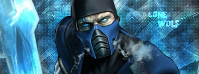
May 14, 2006 #3 Grawr Retired Staff Joined Dec 9, 2005 Posts 6,851 Bells 1,201 Now I'm no sig maker, so I don't really know how to critisize peoples work. I liked the first one because of the cold, icy effect. The second one...I'm not even sure who that character is. Stick with the final fantasy X-II girls, alright? I know who they are.
Now I'm no sig maker, so I don't really know how to critisize peoples work. I liked the first one because of the cold, icy effect. The second one...I'm not even sure who that character is. Stick with the final fantasy X-II girls, alright? I know who they are.