What looks better?

Twisterheart

Senior Member
Joined
Sep 12, 2015
Posts
2,506
Bells
3,599
Eggs
0
Old Eggs
0
Holiday Candy Cane 2017
Ruby
New Leaf Token
Isabelle
Mint
Lobo
White Pansy
The Bell Tree Fair 2017 Patch
I wanted to add more flowers around my lighthouse because I felt like that area was a little bare and too pink. So I took the extra flowers I had lying around and I put them around my lighthouse, but I can't decided what looks better. I like them both but I am conflicted.

Here is what I first did. I like it, but I feel like maybe it isn't enough?
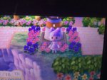
IMG_2192.jpg

And then this is with more flowers... Again, I like this one too but I feel like maybe it is too much.
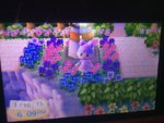
IMG_2191.jpg

I can't decide. What looks best? Should I do something different? Let me know.
 
The first looks more organized but the second one looks more full so I'd go with the second one. :)
 
I like both! Could you possibly extend the path in the first picture so that you can have the flowers be more organized? I would do that!!!
 
I like the second one! The empty space on one side would bug me a little bit, but that's just me! Both look awesome :)
 
I was about to say the first one but I think the empty space would bother me a bit. Though I'm a simple person and think 2 color combos are plenty. Hmm.
 
I like both! The first one is more organised, but the second one is less bare.

I'd keep the blue pansies on the left side of the lighthouse, but not the ones below the lighthouse. But whatever looks better is up to you. c:
 
What if you filled the empty area in #1 with all of the same colored flowers? I think that would look super great. If you don't have matching ones I would stick with #2!
 
The first one looks more balanced and the flowers are organized. Maybe if you can just extend the path to cover the empty spaces? I honestly don't like the flower combination on the second. While it's great to have more, the pink and purple flowers would shine more (like how it did in the first) if you eliminate the pansies in the outer part. Just my suggestion. It's still up to you, whatever you feel that looks best :)
 
i'd go with the second, it looks nicer. although the first one is neater the plain bit bothers me.
 
My personal vote is for the second one. I think it snazzes it up just enough without straying too far from the original color pallet. If you do decide to go with the first setup, perhaps you could move the path over a space to fill in the gap?
 
Back
Top